


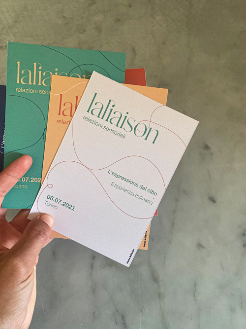
laliaison
Introduction.
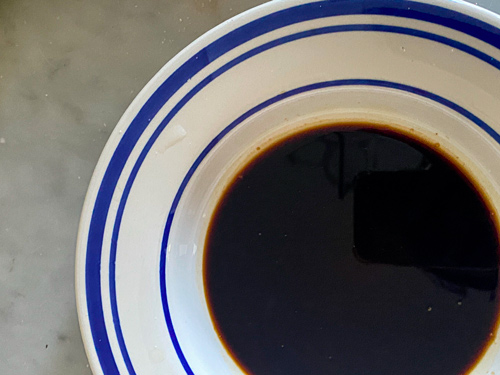
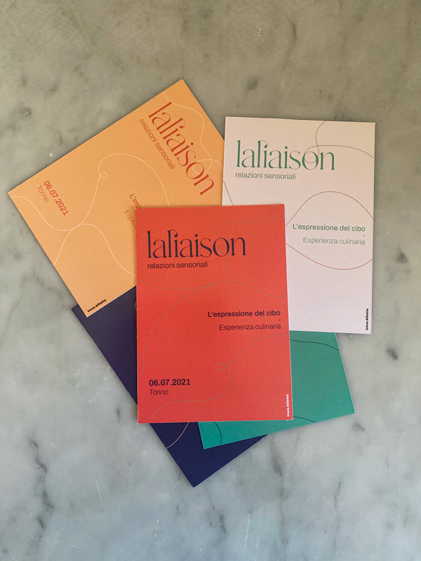
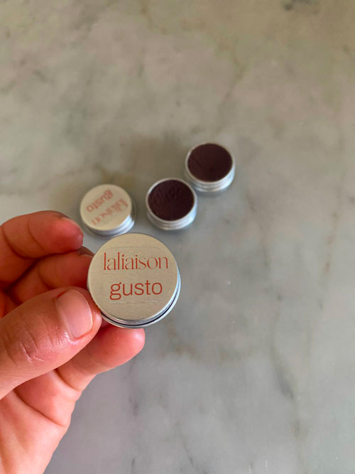
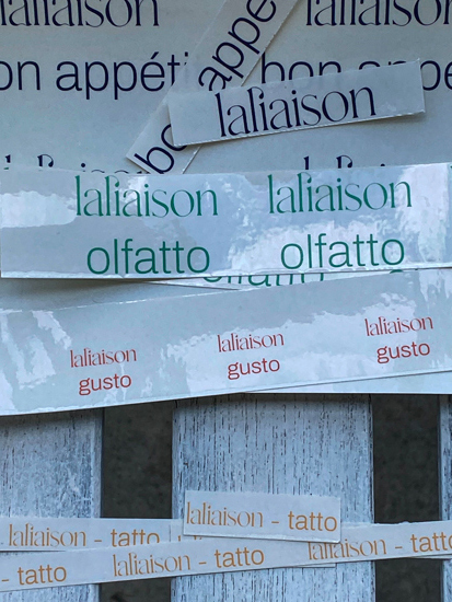
Laliaison is a culinary experience having two active protagonists: the four senses
(touch, hearing, taste and smell) and food. Living in a world in which food perception
is highly affected by visuals, I have tried to isolate the human sense of sight.
The other senses therefore achieve free participation and expression,
creating synesthesia between them.
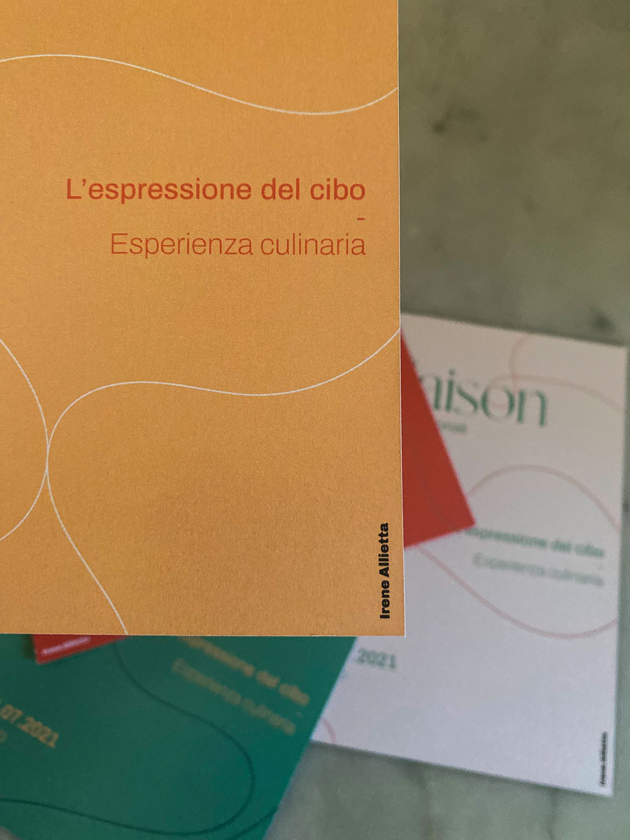
Culinary experience.
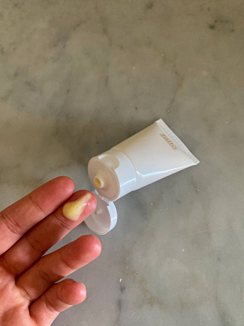
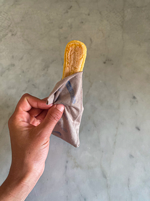
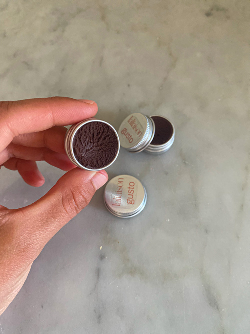
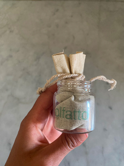
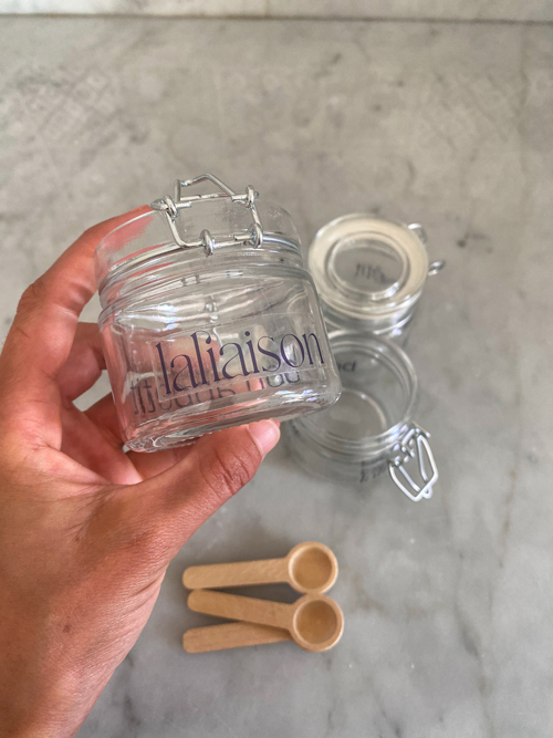
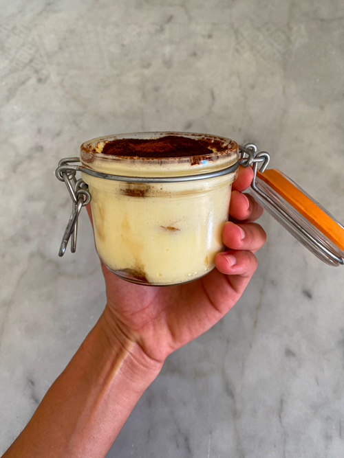
The chosen dish (Tiramisù) is kept secret from participants. Each one of the four ingredients selected is linked to a sense, to whom a color is in turn associated. Also, ingredients are hidden inside specific objects, on which a sticker indicating the sense to be stimulated is placed.
Objective.
The project relies on communication occurring through food, which conveys its personality through the peculiarities perceived by our senses. The aim therefore is to extend perceptions, feelings and subjective emotions, consequently broadening the participants’ communicative and creative world.
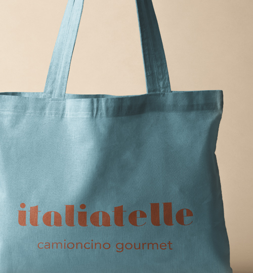
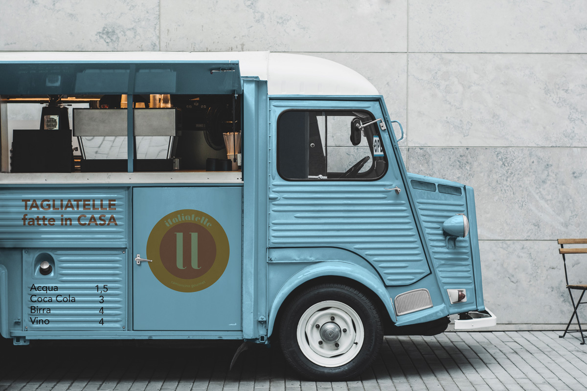
Italiatelle
October 2019
Brand design & realization of an exhaustive guideline.
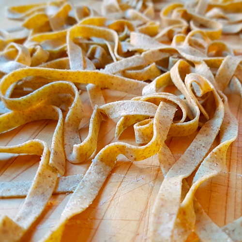
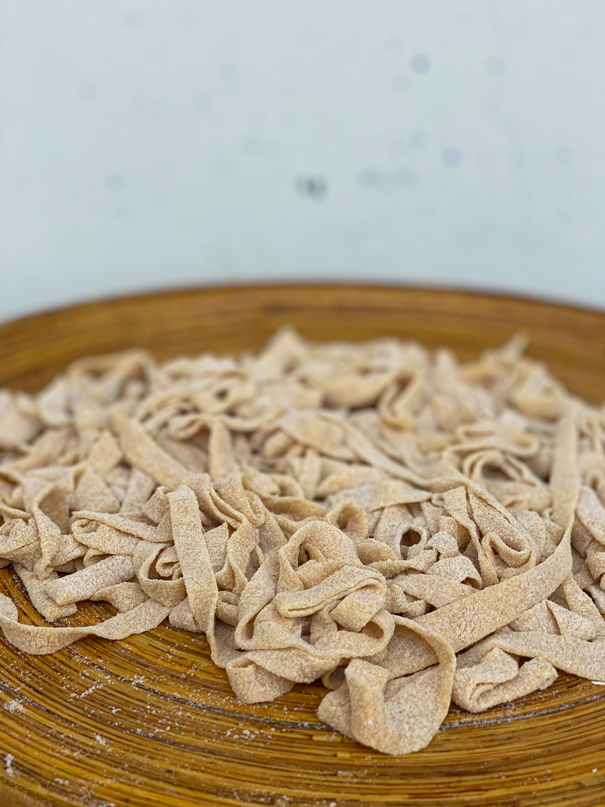
“Italiatelle” gives birth to a culinary experience allowing people to meet with authentic and traditional Italian cuisine, thanks to the characteristic light blue van travelling around cities abroad to serve a hot dish of tasty hand-made tagliatelle.
Who we are & what we offer.
Italiatelle is a little truck found driving around major European cities, offering hand-made tagliatelle dishes dressed in a variety of typical Italian sauces. Perfectly combining the “street food” and “gourmet” concepts with a quality dish served in the open, Italiatelle is the result of a unique sensorial experience unveiling the truest and most genuine Italian tastes, abroad.
Our target.
Italiatelle targets and hopes to retain clients with no gender distinction, generally point to people loving good quality food and actively looking for new culinary experiences, while being inclined to discover new cultures and traditions.
Mission.
Providing the means to discover a significant and pure piece of Italian culinary tradition, to those who desire it. As opposed to many Italian restaurants abroad, adapting and modifying Italian recipes to different tastes and preferences, Italiatelle carries a little bit of Italy on a small truck, by maintaining its authenticity and offering the emotion of a real “piatto all’italiana”.
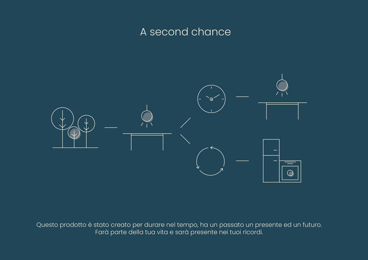
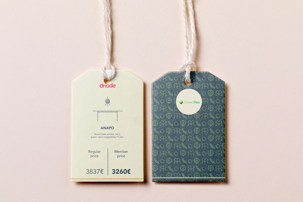
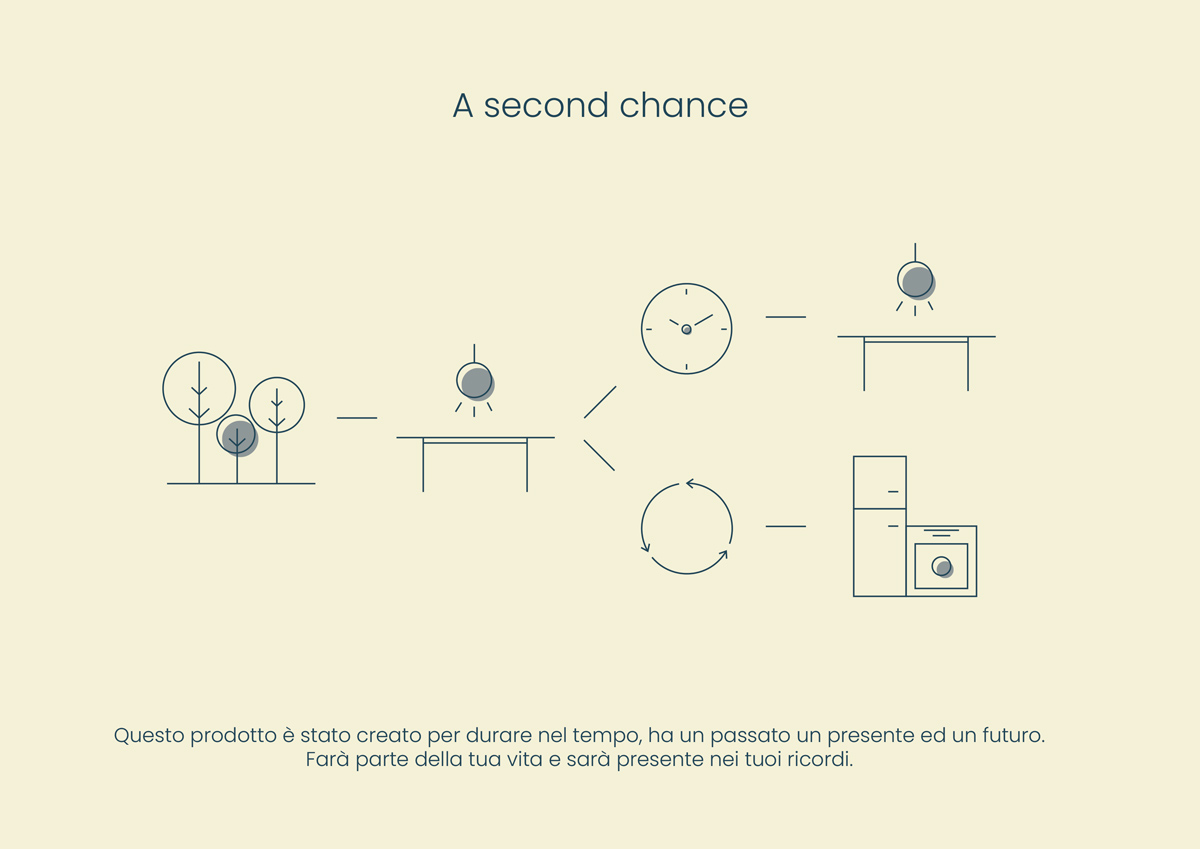
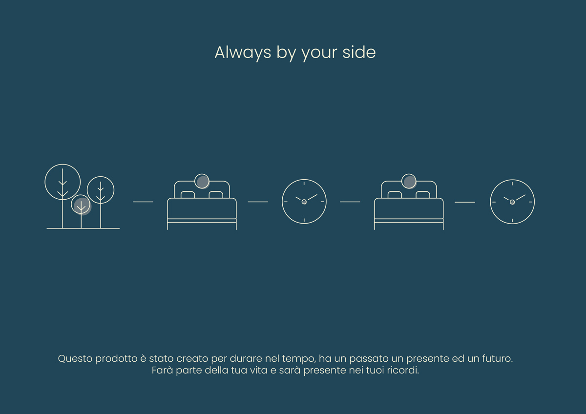
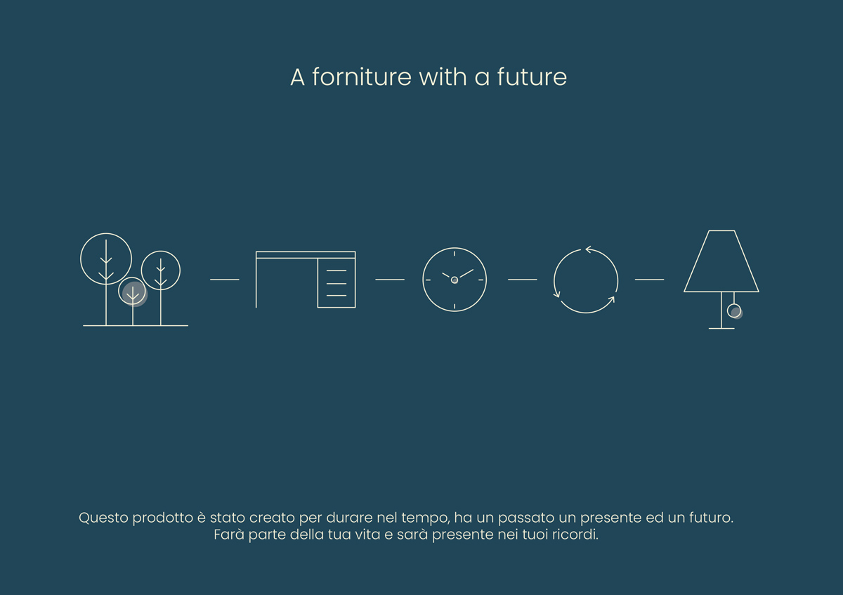
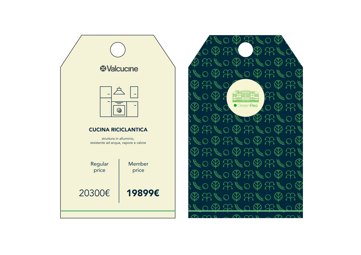
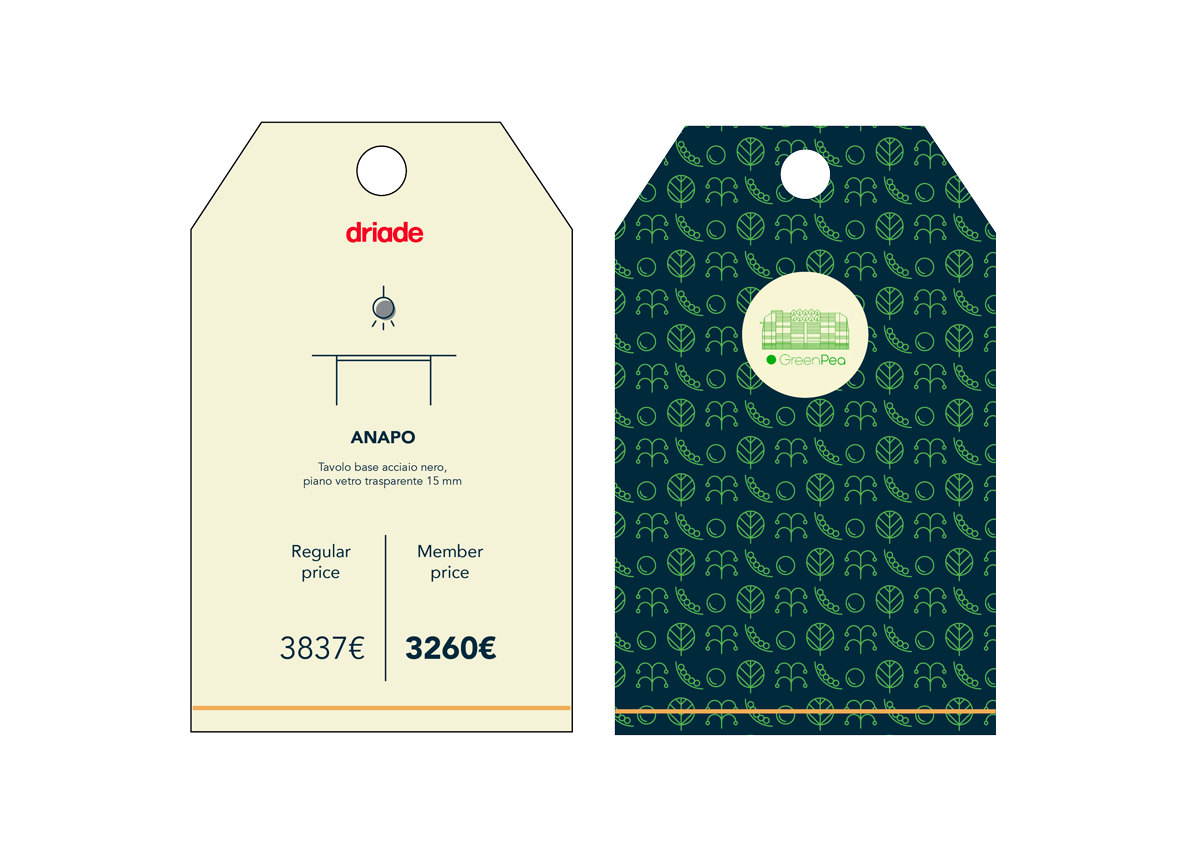
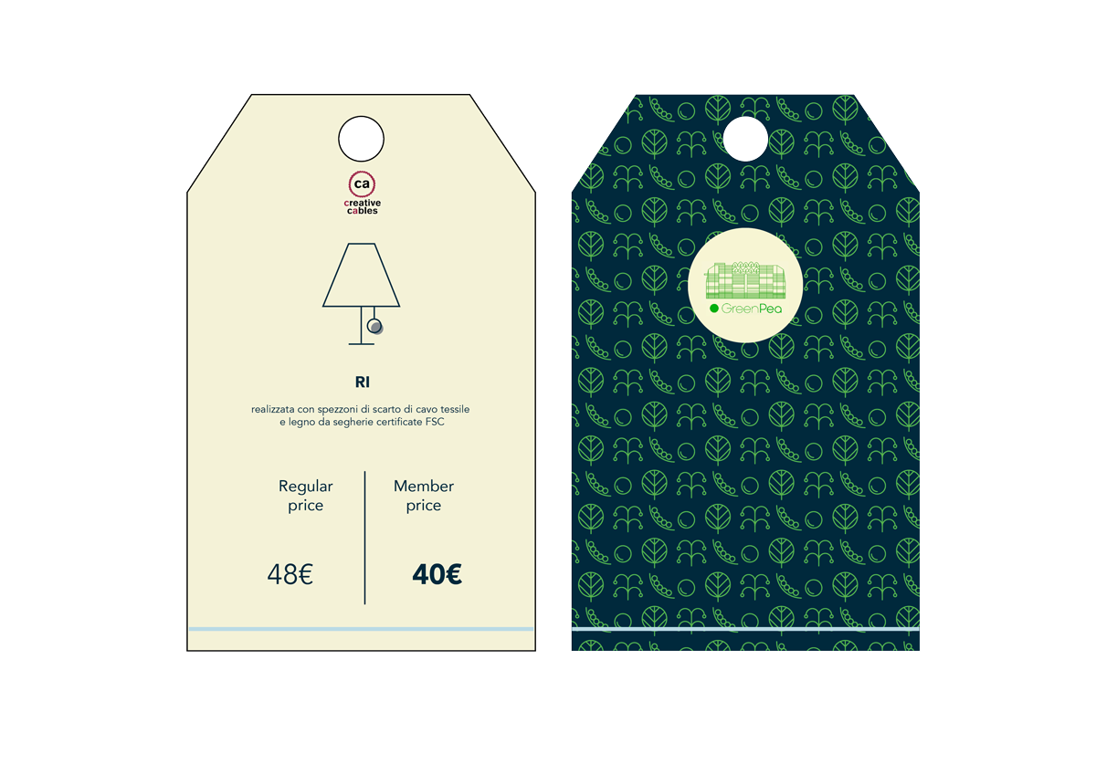
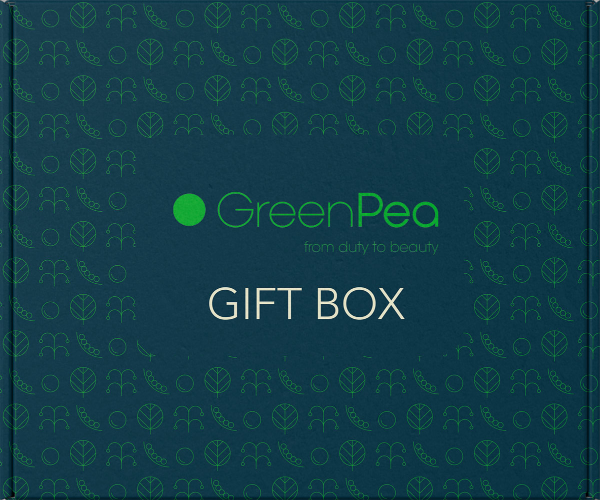
Armonia
Introduction.
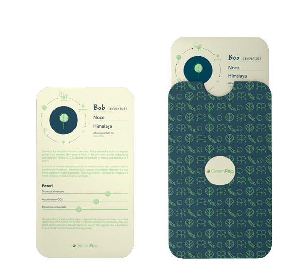
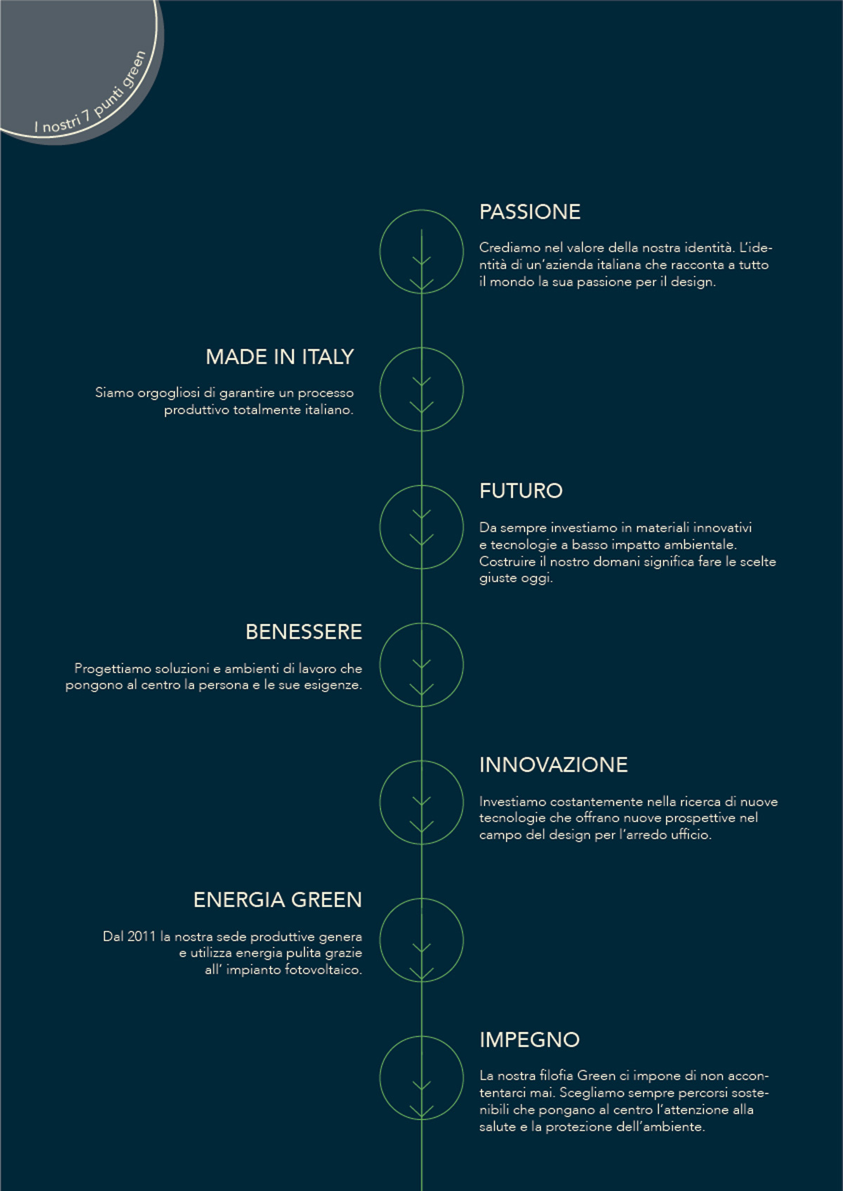
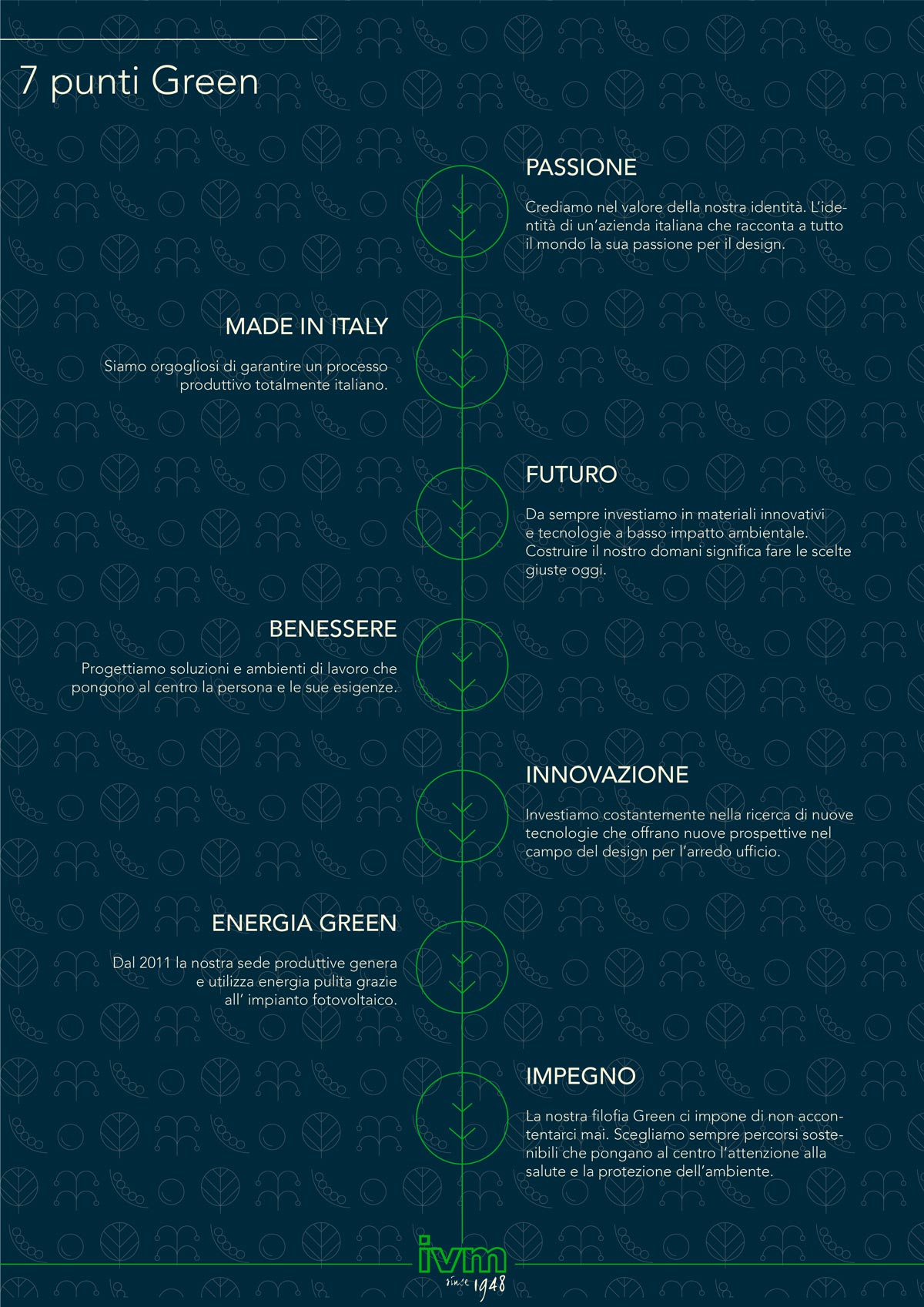
In collaboration with GreenPea, it has been decided to develop the internal communication
of the company’s Home floor. The concept chosen as heart of the communication was:
‘sustainable and durable’. In fact, durability represents a fundamental value: buying
a nice and sustainable piece of furniture being aware that it will last in the future
is an ethical and respectful choice. Any furniture has its story and it will be told
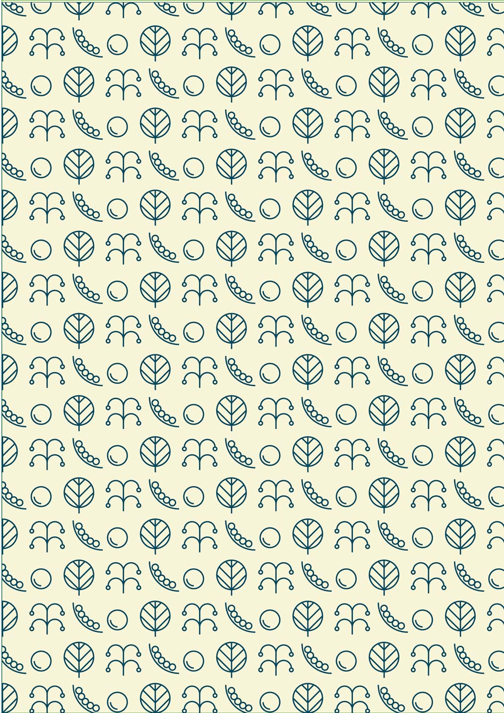
through the so-called ‘durability line’, found on every item in the store. The icons
of a pea plant represent GreenPea and the foundations on which its reality is built upon.
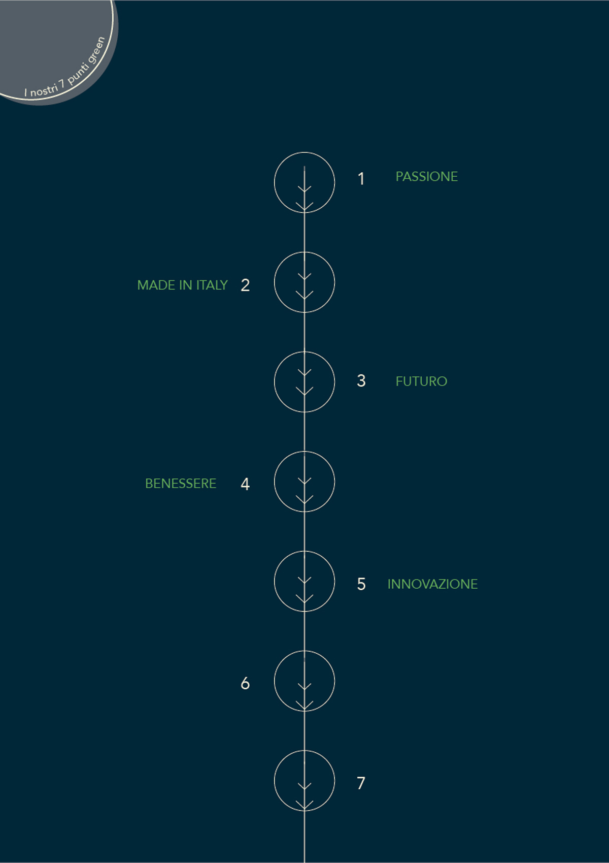
Application.
In the process of developing the concept and thinking about its graphic application,
it has been decided to center the communication around storytelling, in particular:
sustainability, design, life and growth stories. Graphically, the narrative will be
structured in various ways and represented by a timeline. The line also becomes a symbol
of union among partners and the GreenPea reality.


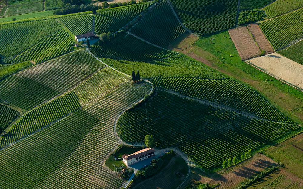
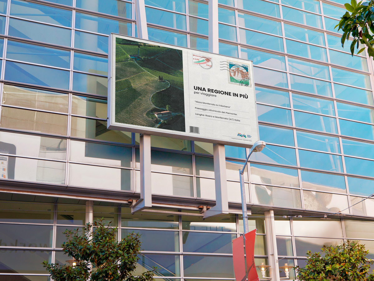
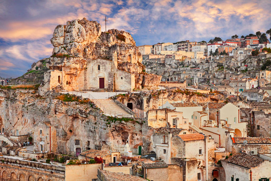
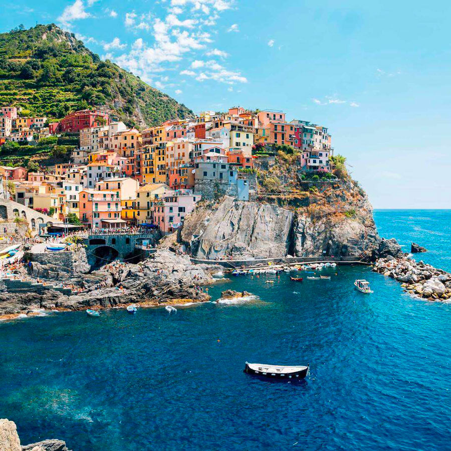
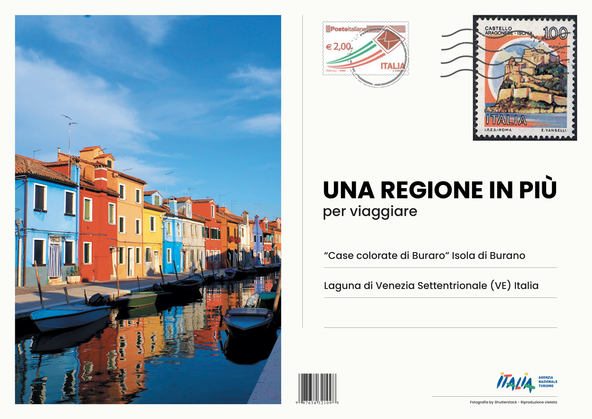
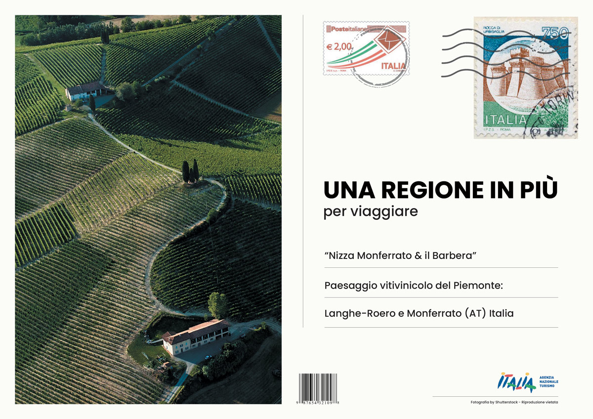
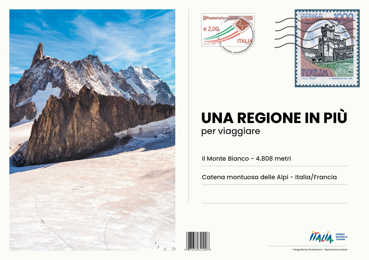
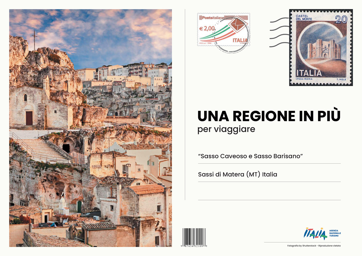
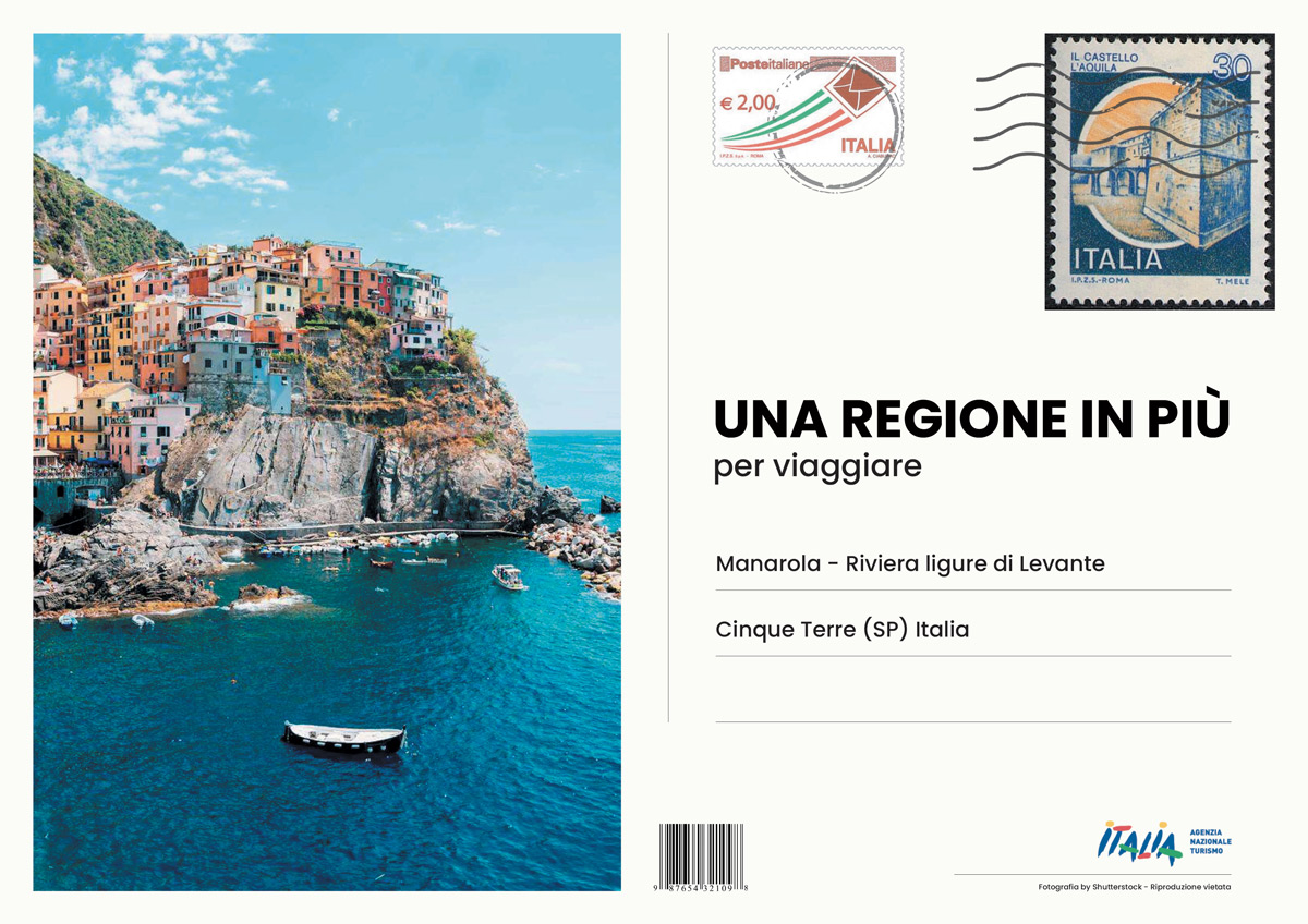
Una regione in più
The purpose.
The National Tourism Agency (ENIT) sets in motion a (fictitious) tender notice for a press campaign encouraging both national and international tourists to travel or get back to travelling to Italy as soon as possible.
Concept.
Postcards have always represented a travel icon. They effectively constitute a souvenir storing our memories of holidays, trips, experiences, or special moments that we bring along with us and showcase to others.
By acknowledging and leveraging this insight, ENIT sends out postcards around the world depicting various attractive Italian places, inviting tourists to get back (travelling) / come back to Italy.
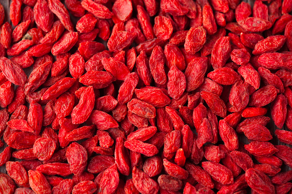
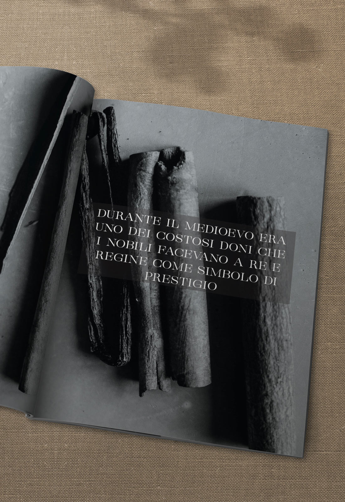
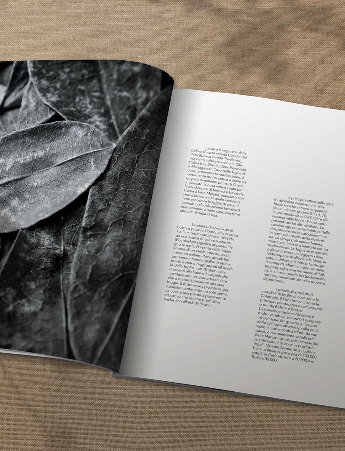
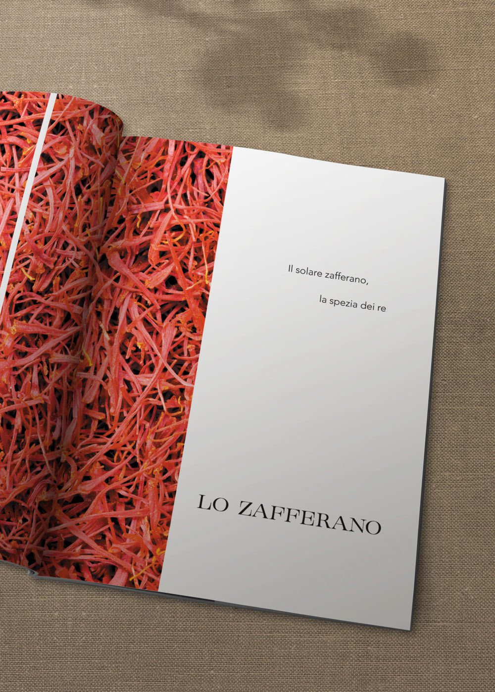
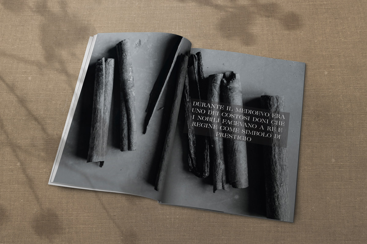
Zenzero
Typographic font realization by the means of the program Glyphs and creation/conception of a font-linked magazine.
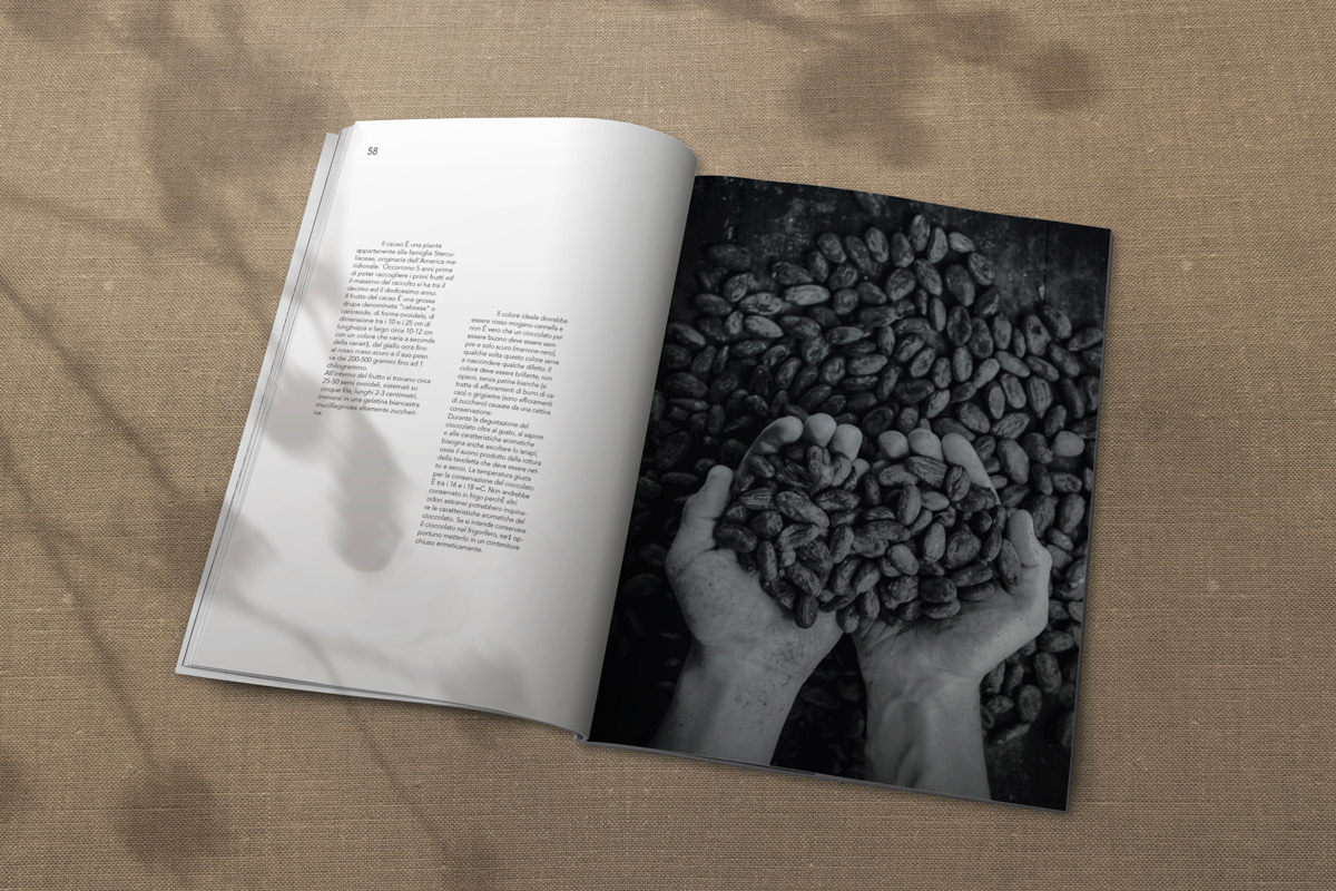
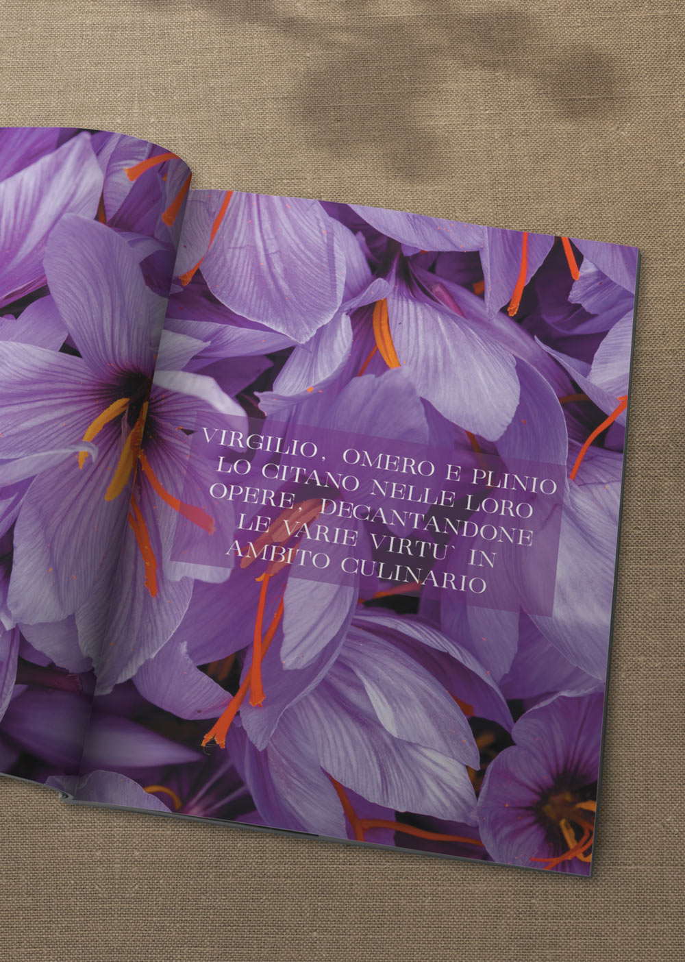
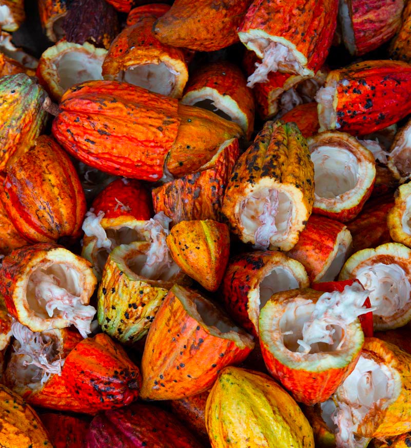
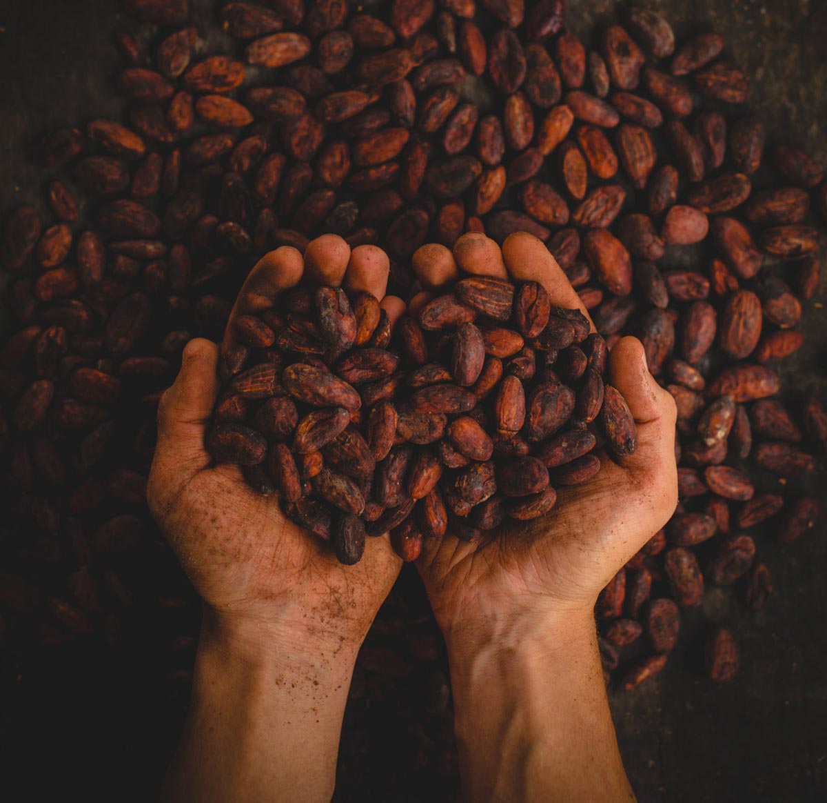
The “Zenzero” magazine deals with the beauty and history of a selection of foods, with a particular focus on spices, aiming to arise interest in this sector/field/area.
The font used is solely capital Serif, employed in the section title(s) and in the two curiosity pages.
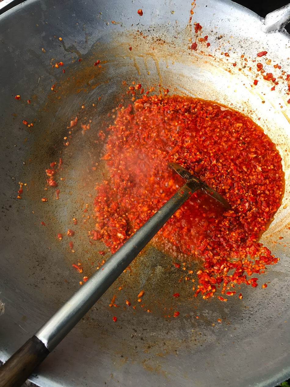
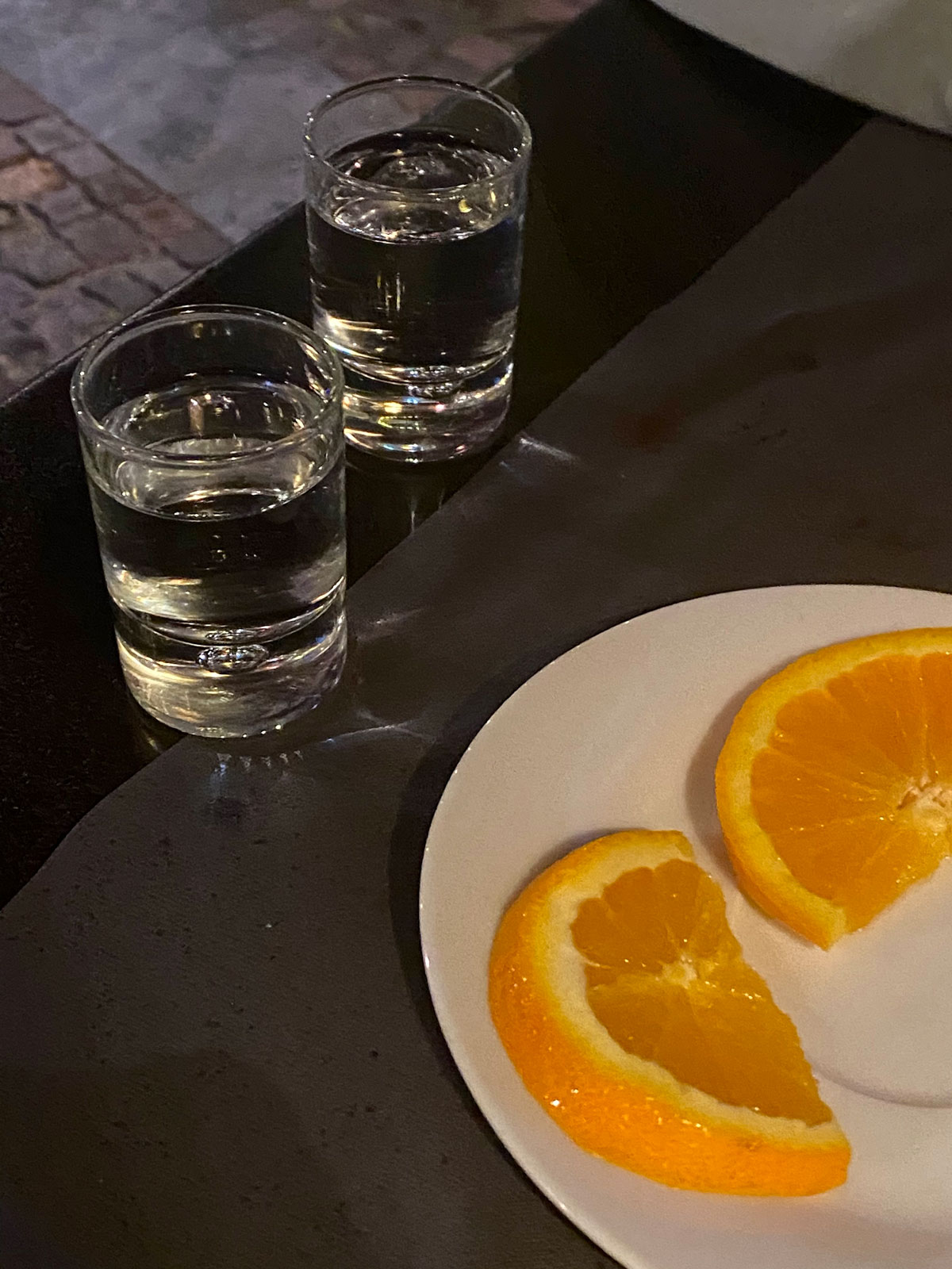
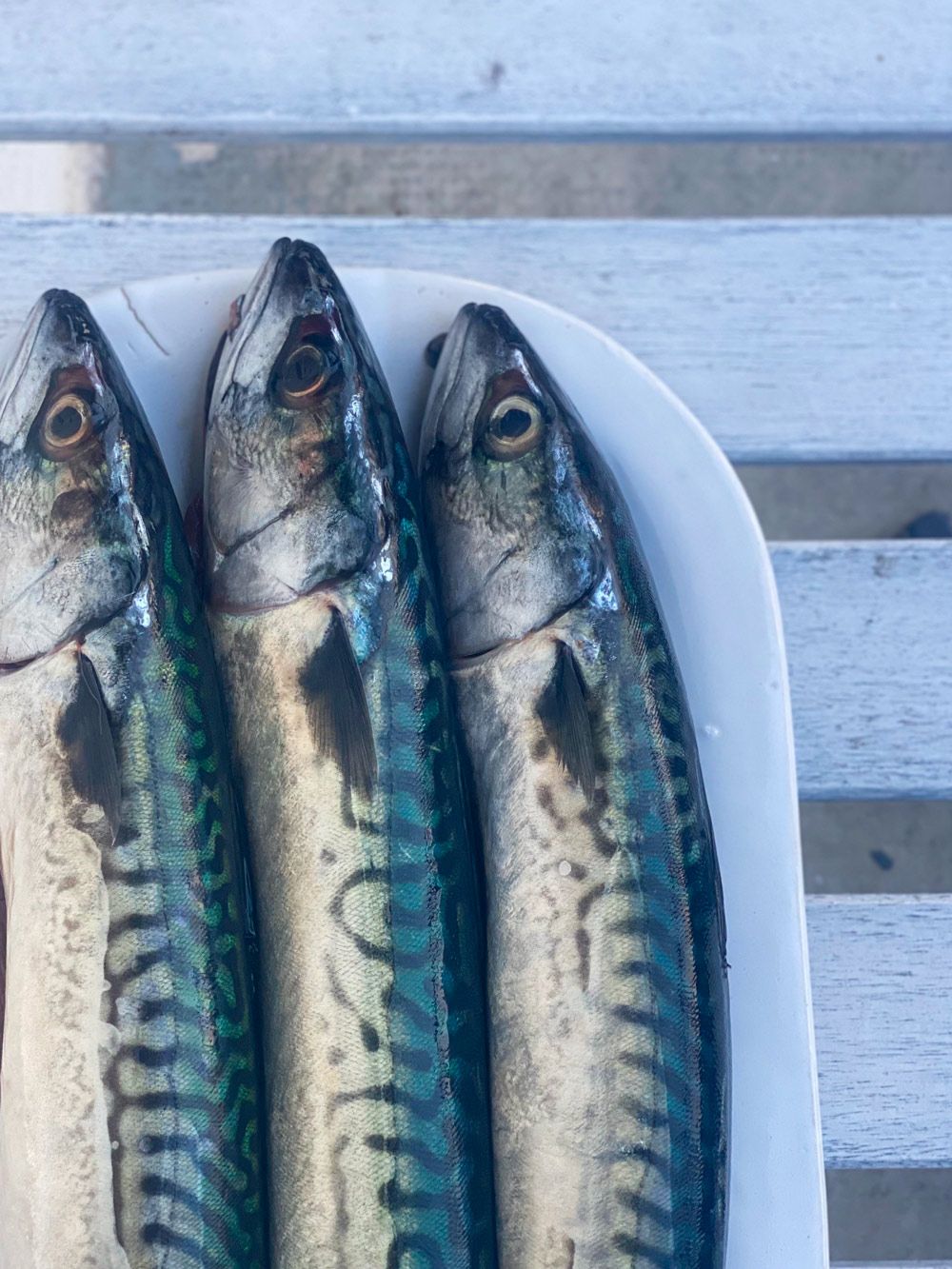
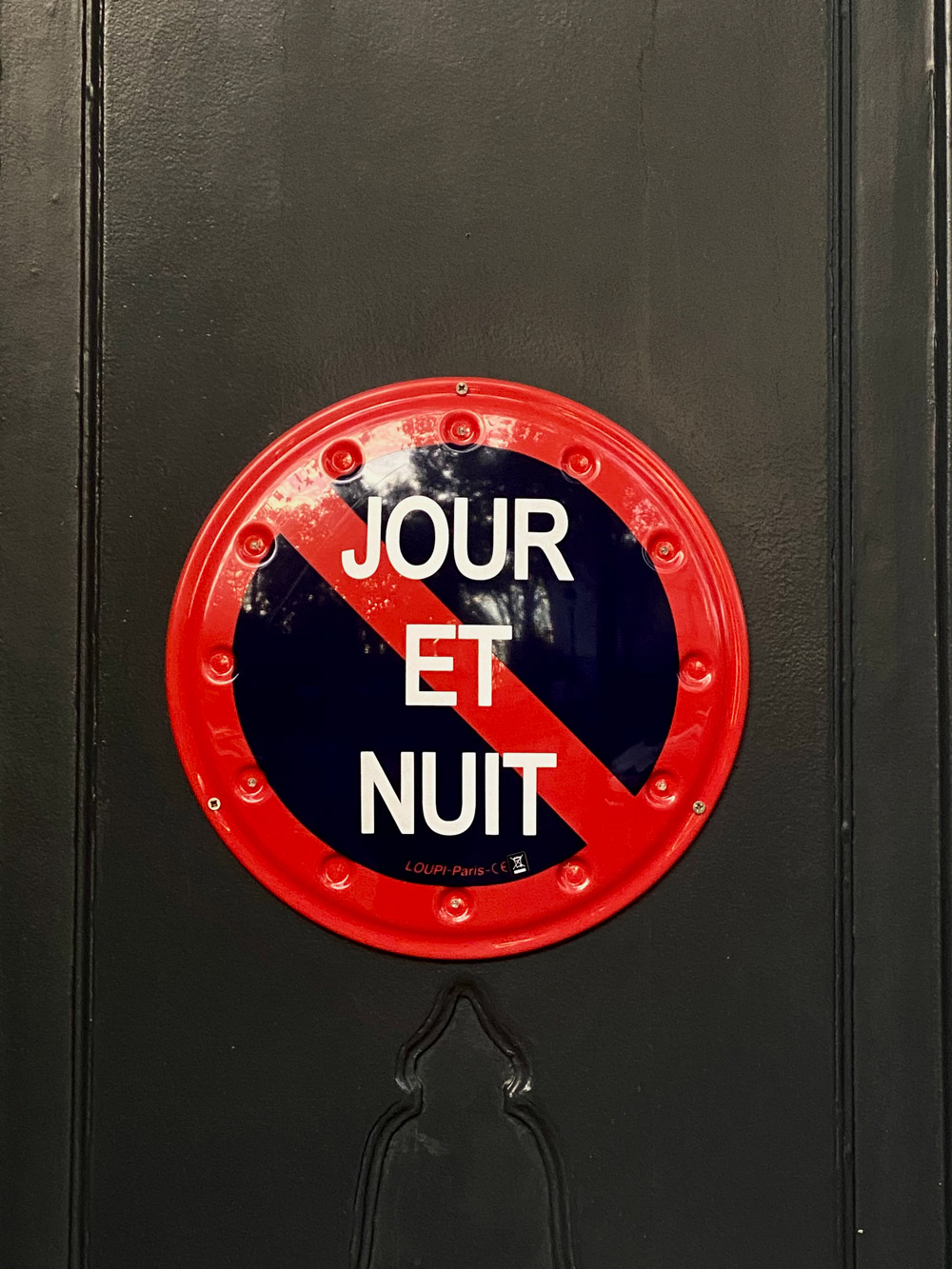
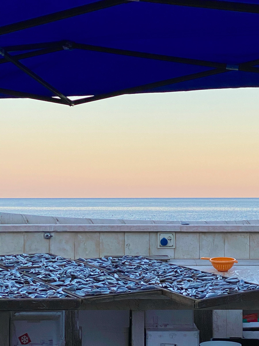
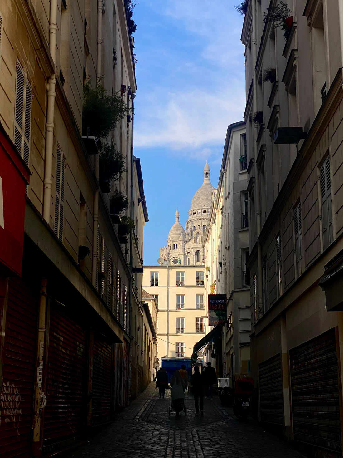
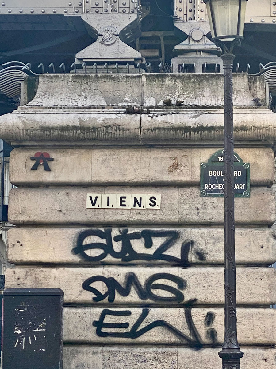
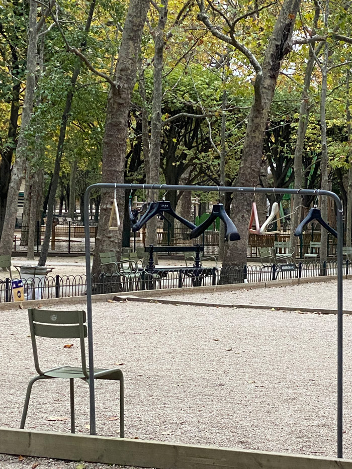
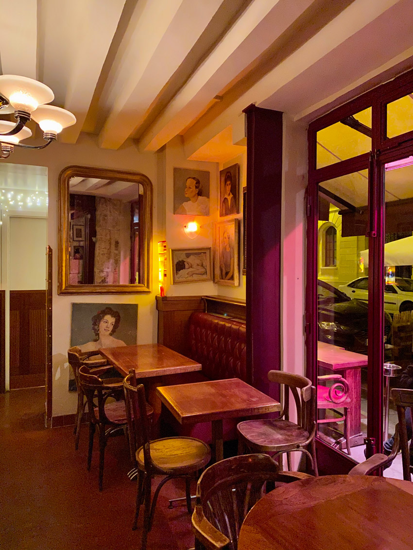
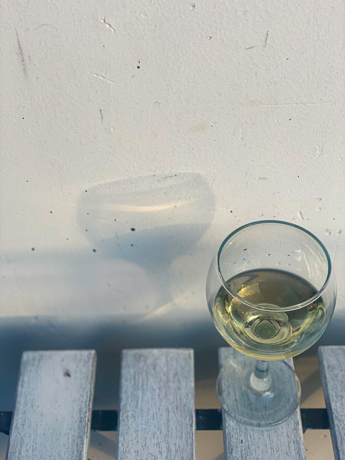
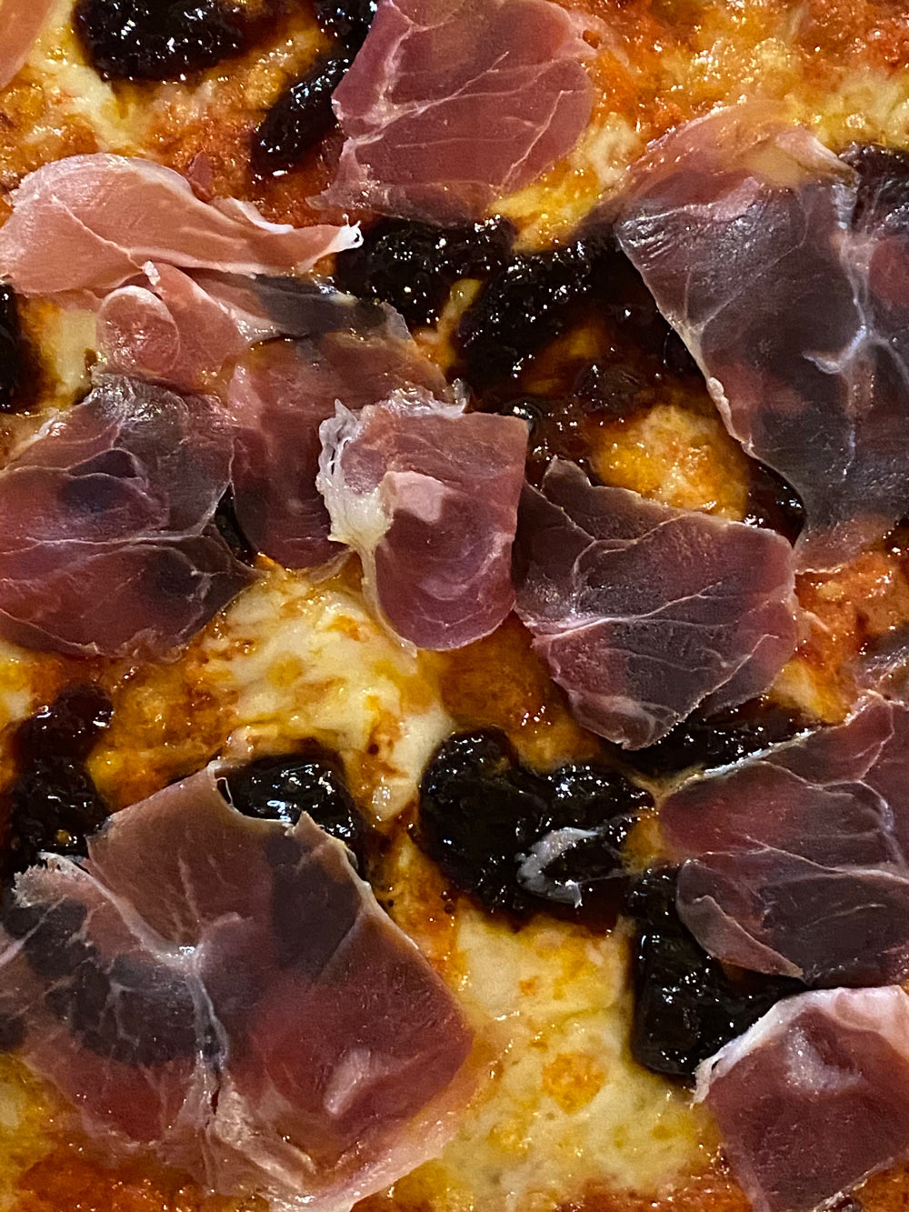
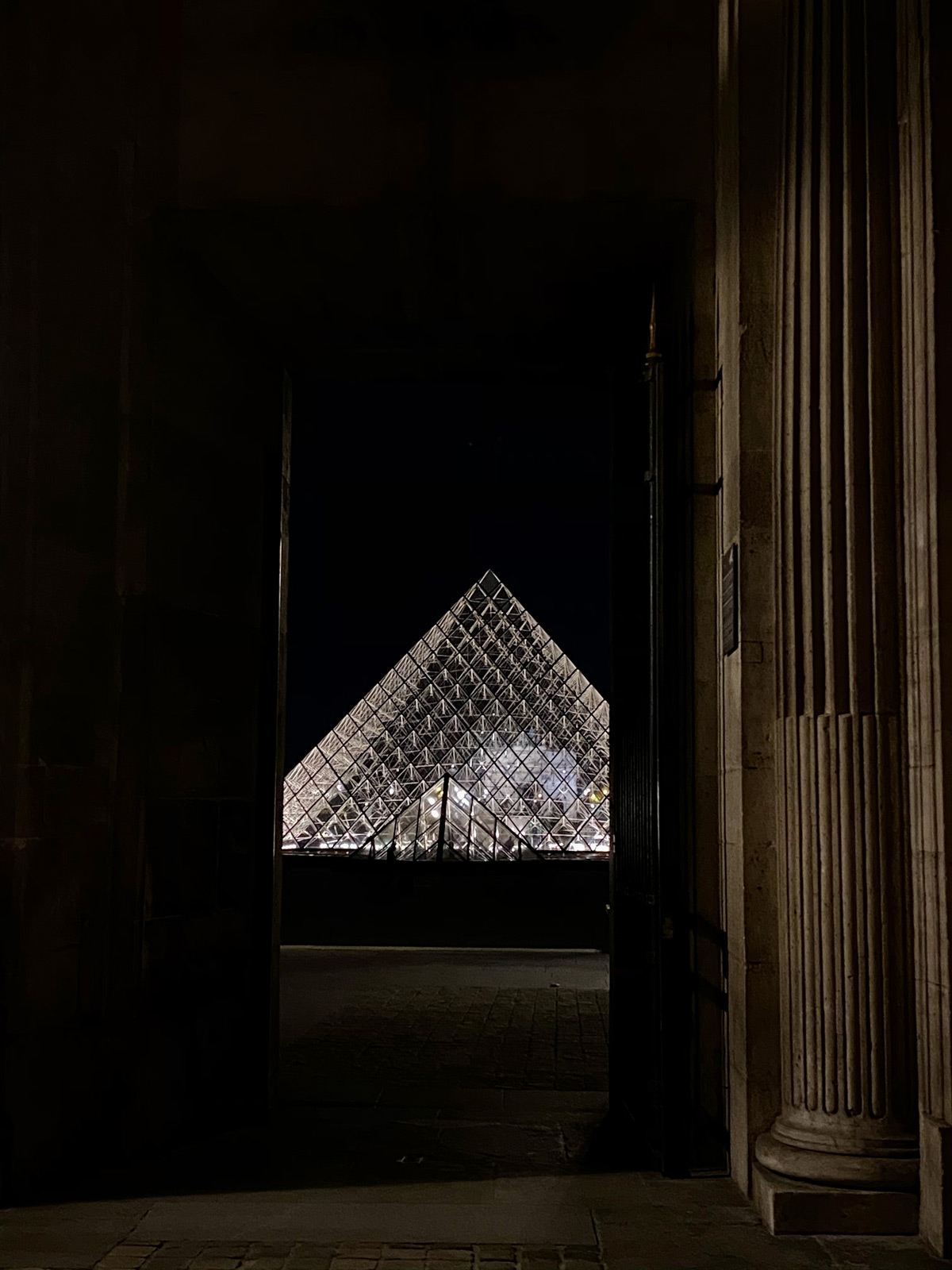
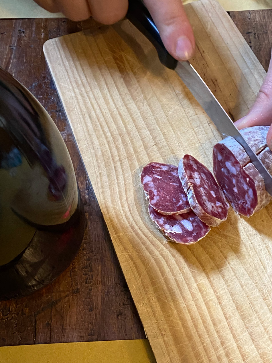
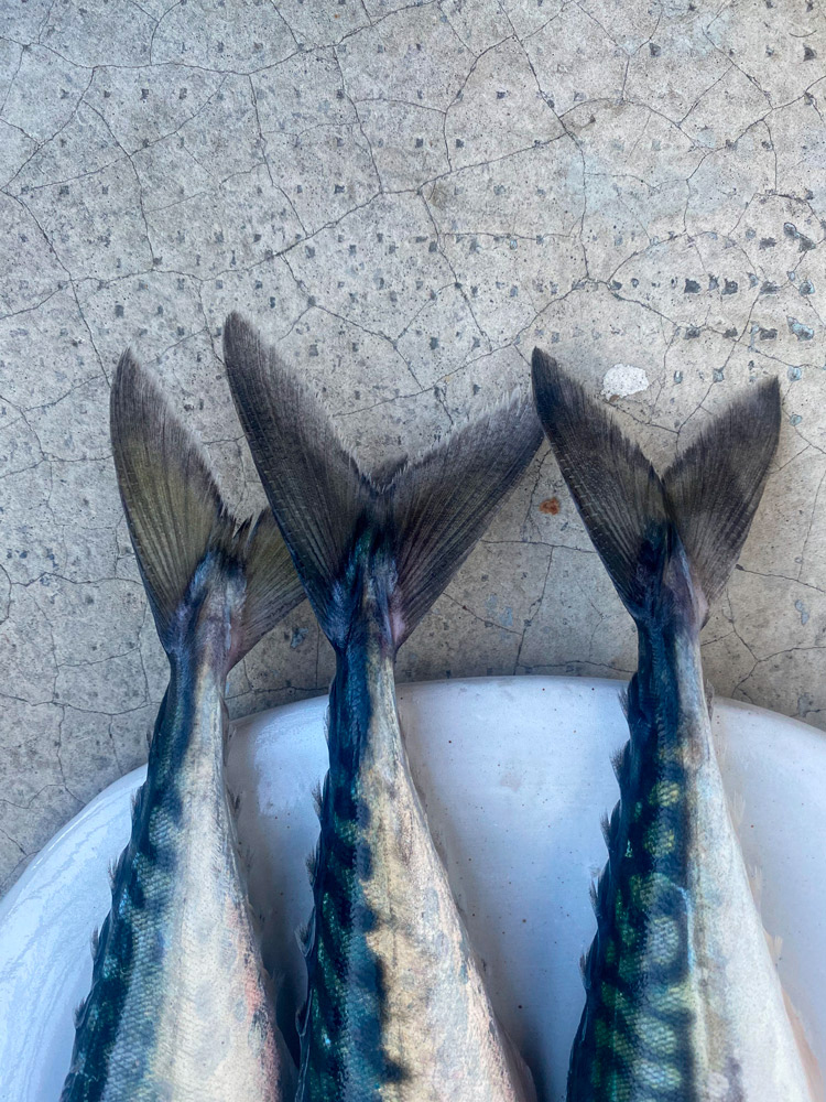
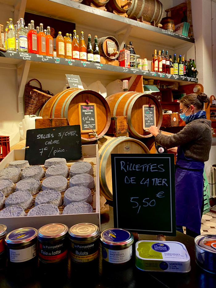
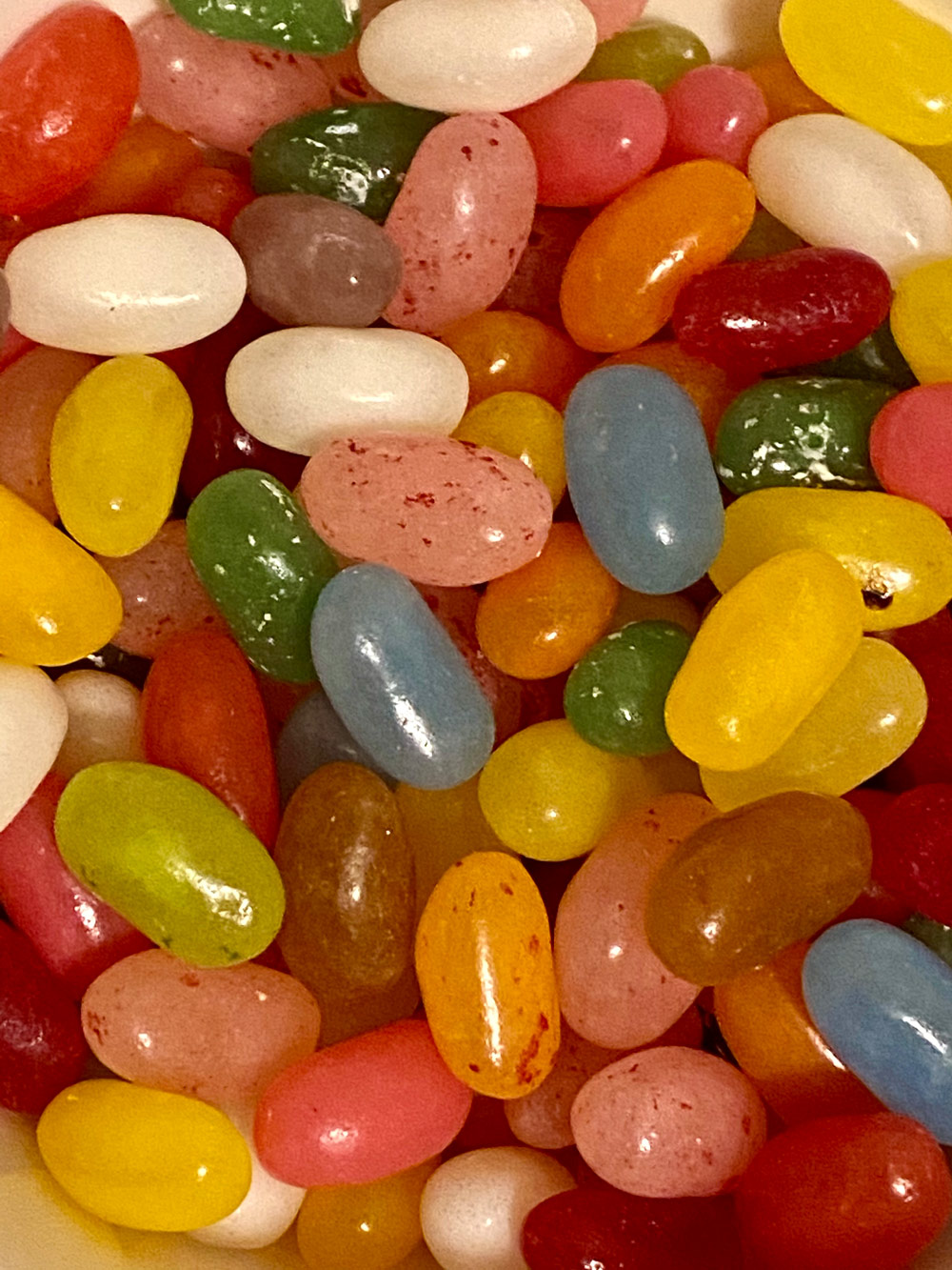
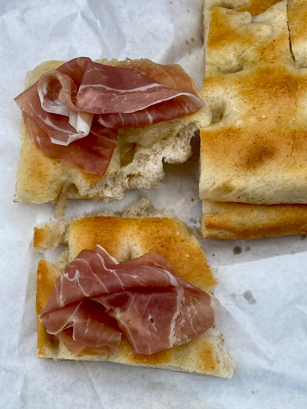
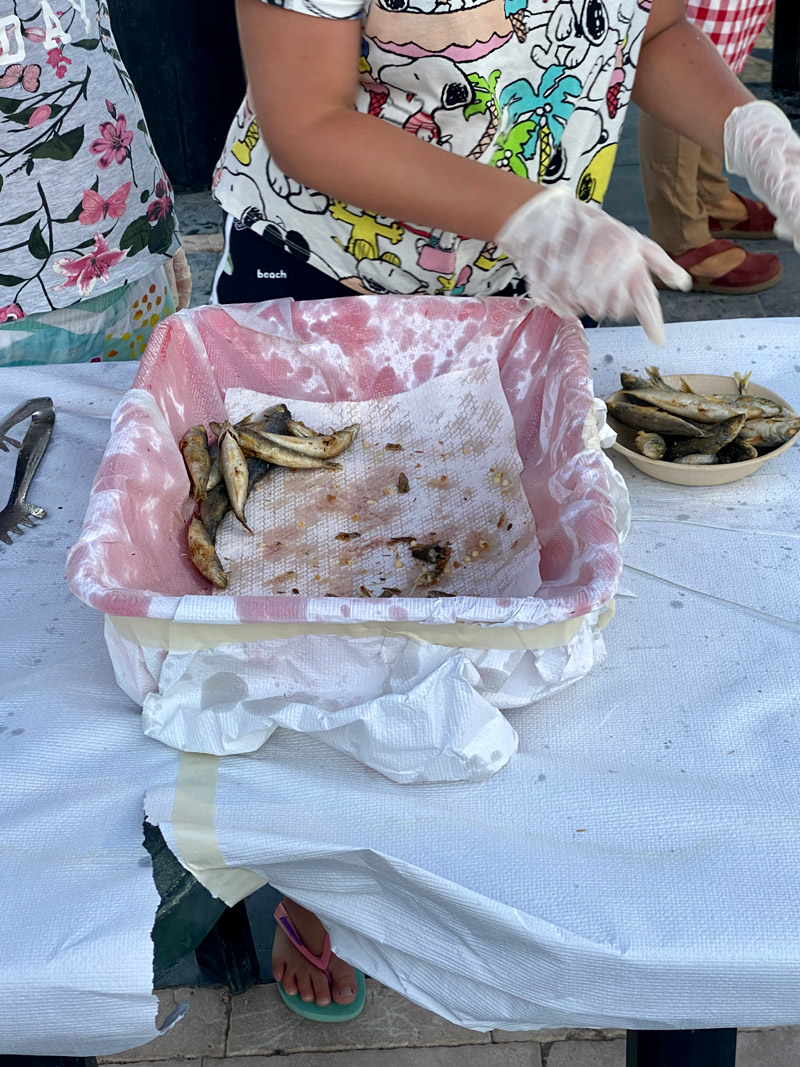
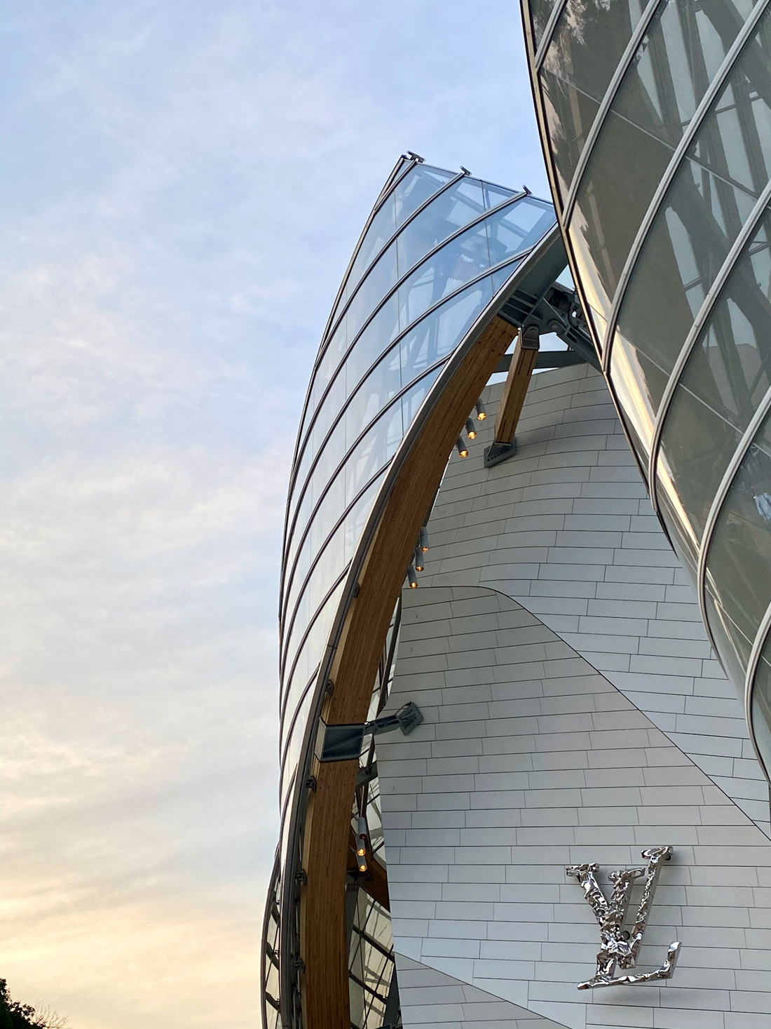
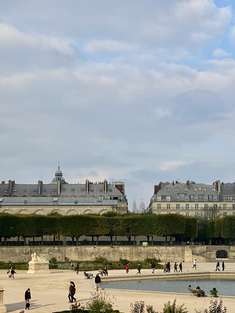
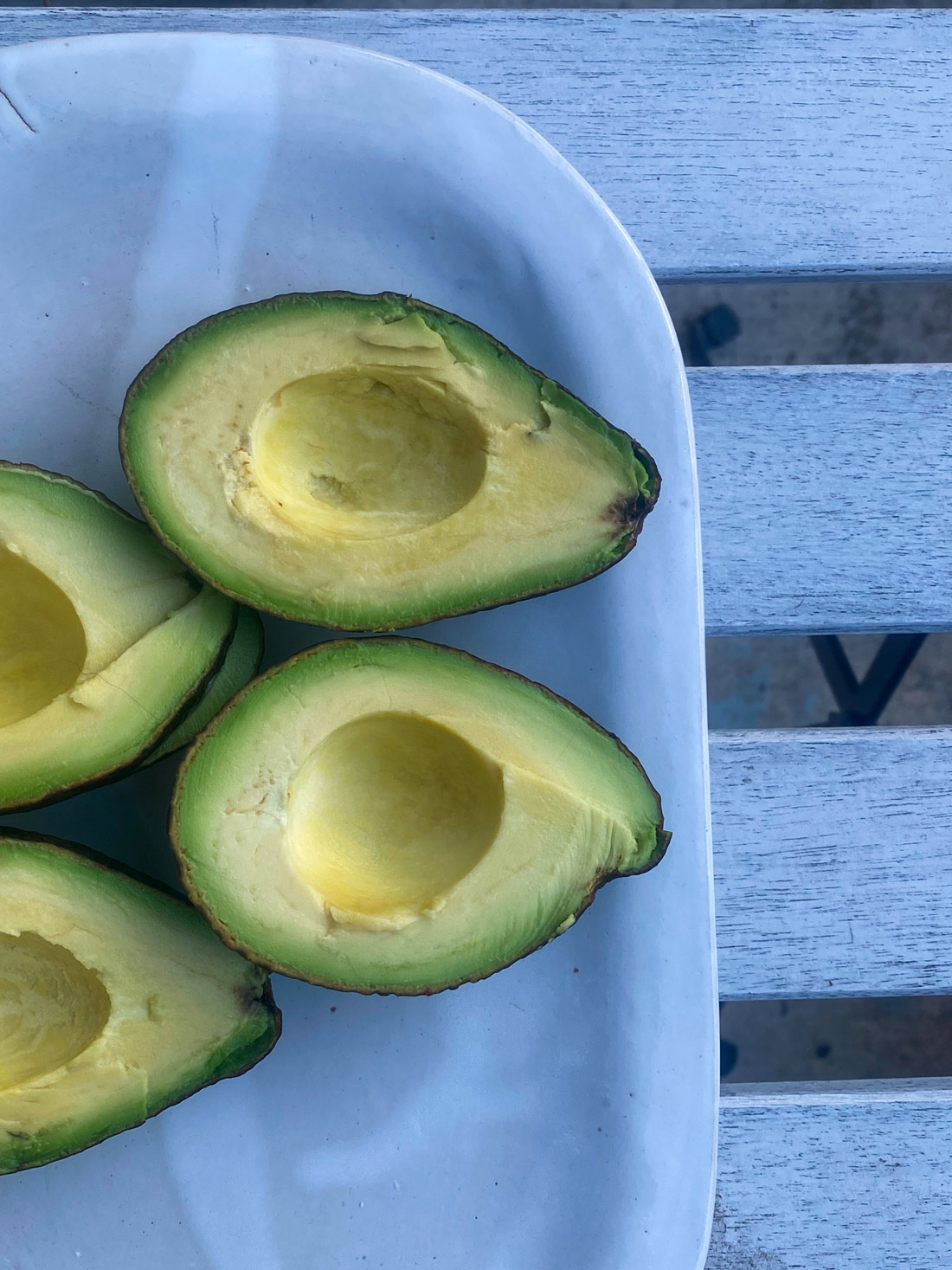
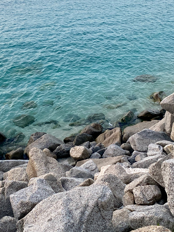
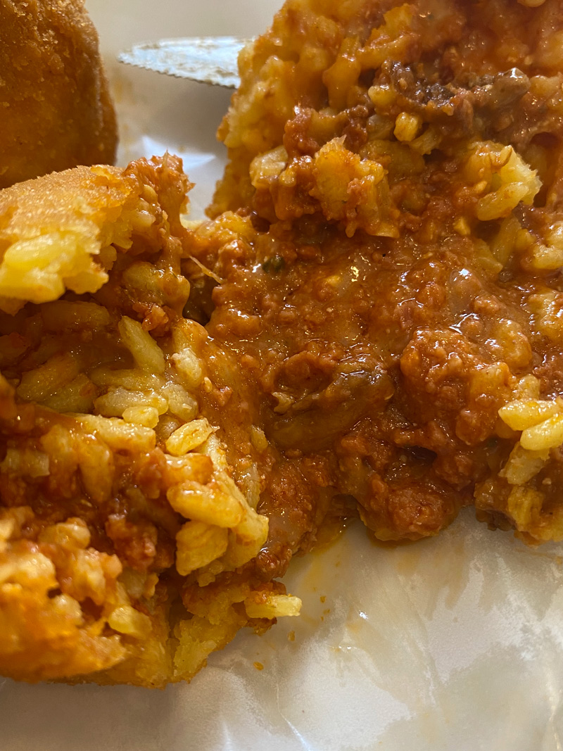
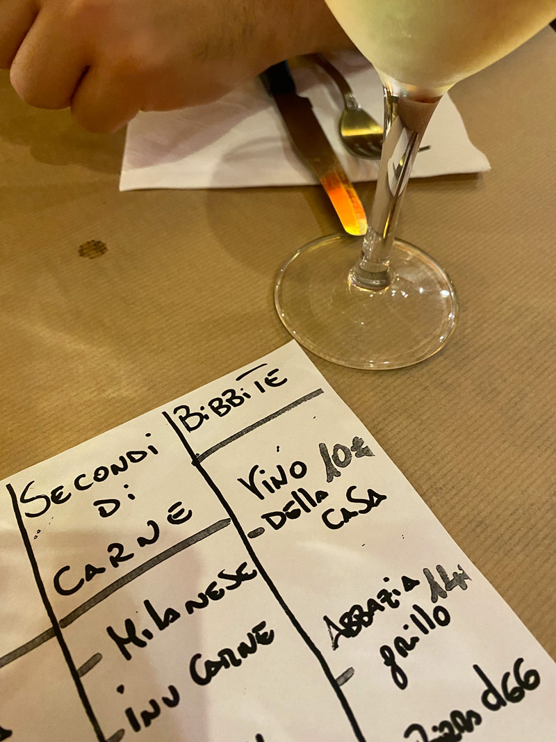
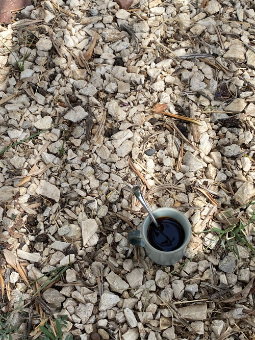
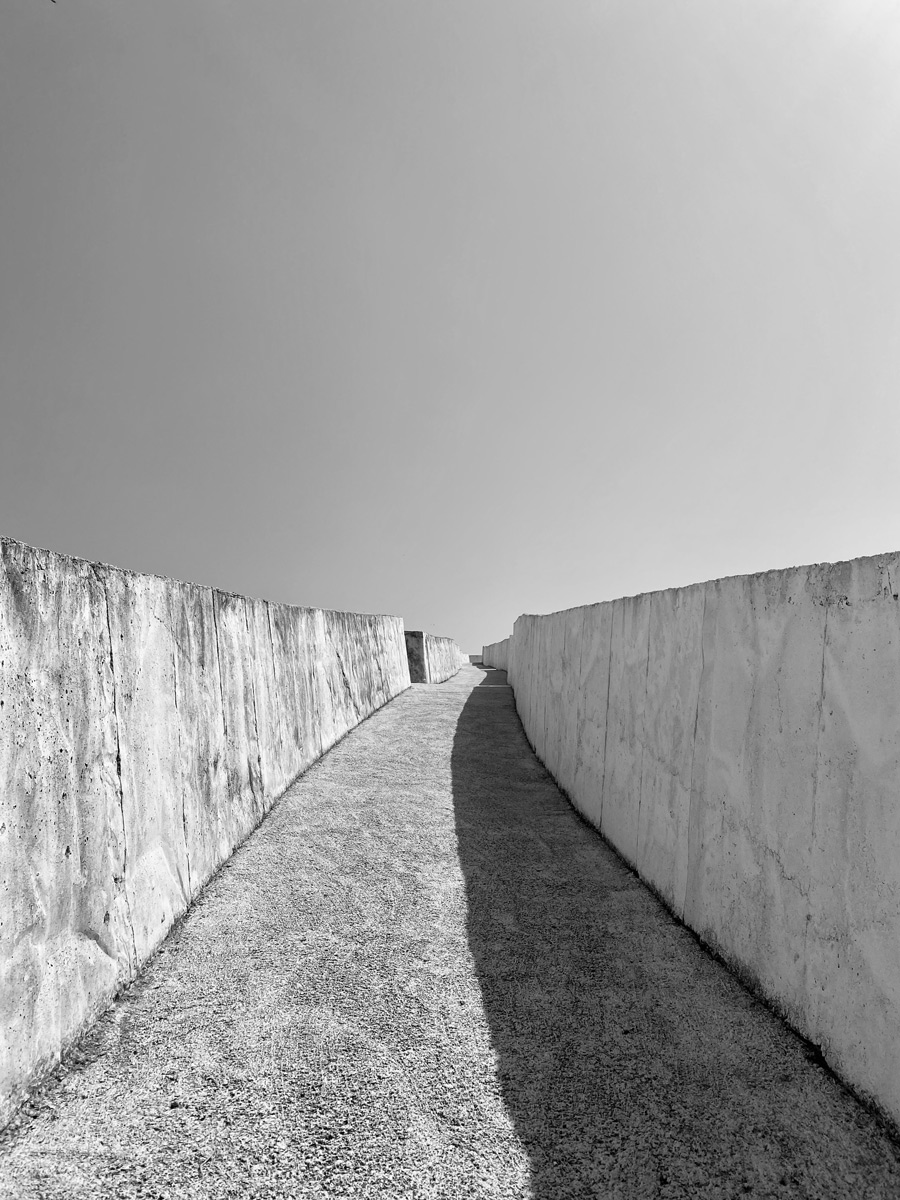
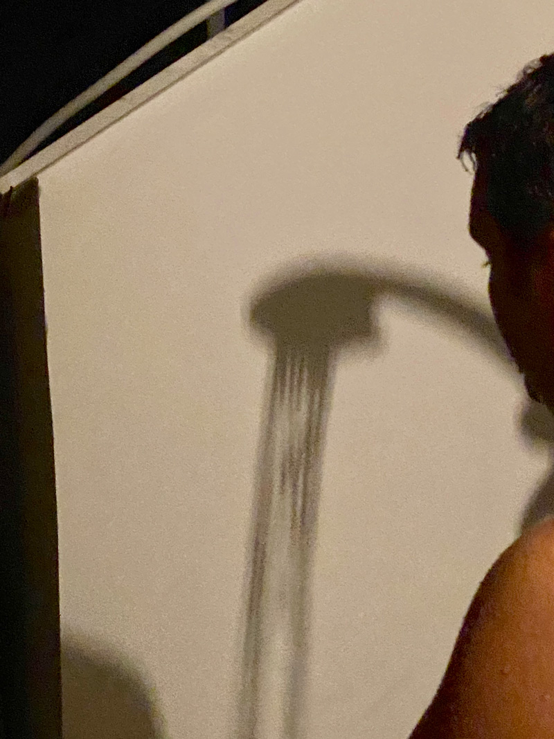
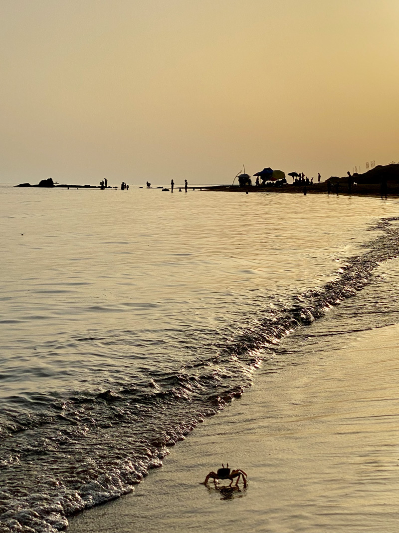
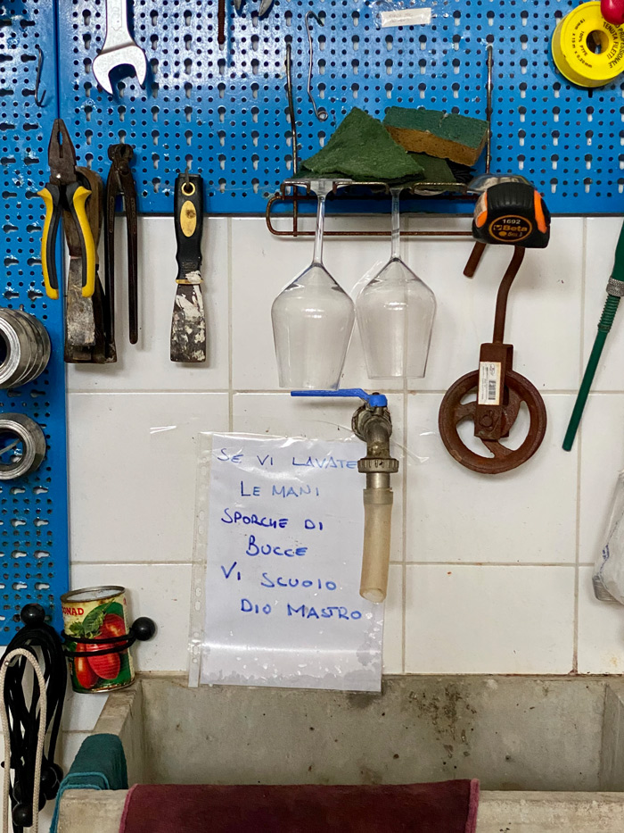
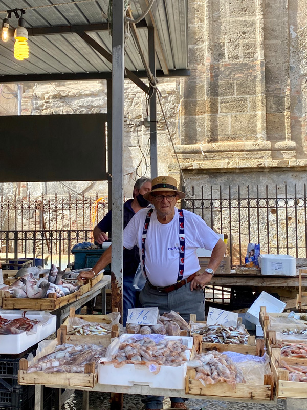
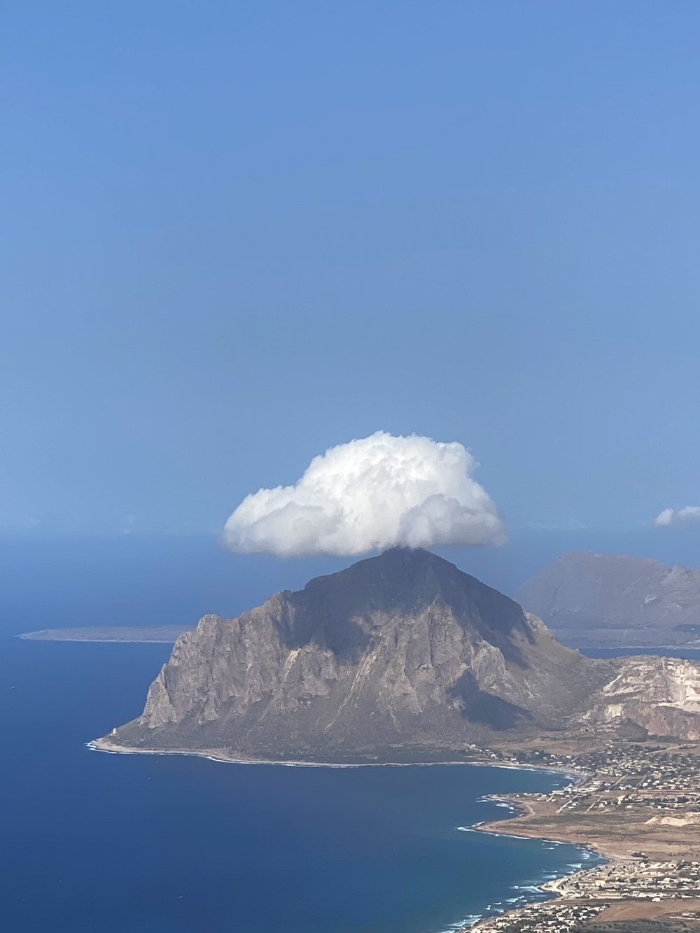
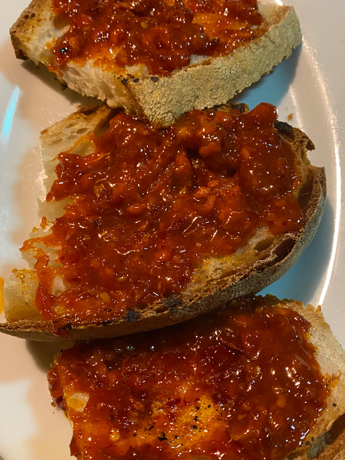
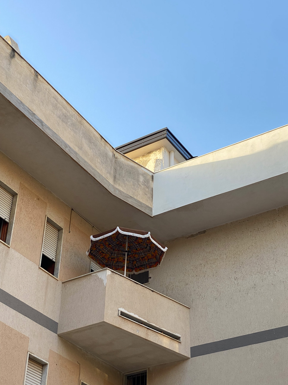
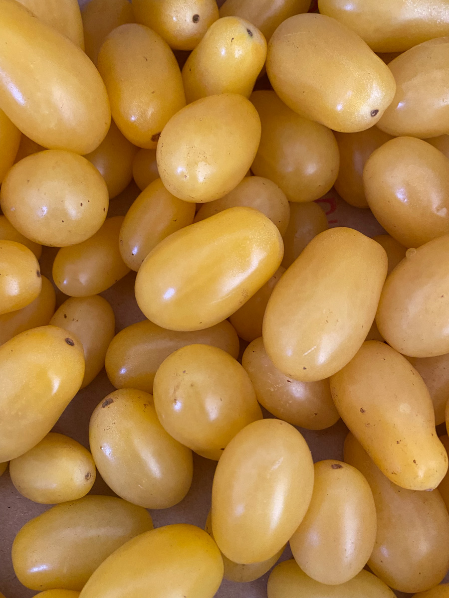
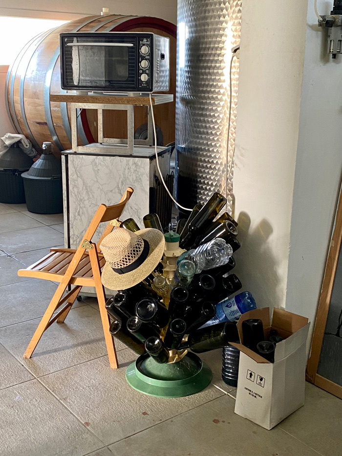
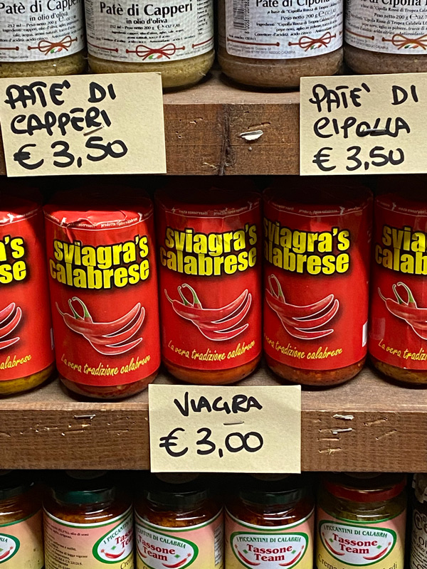
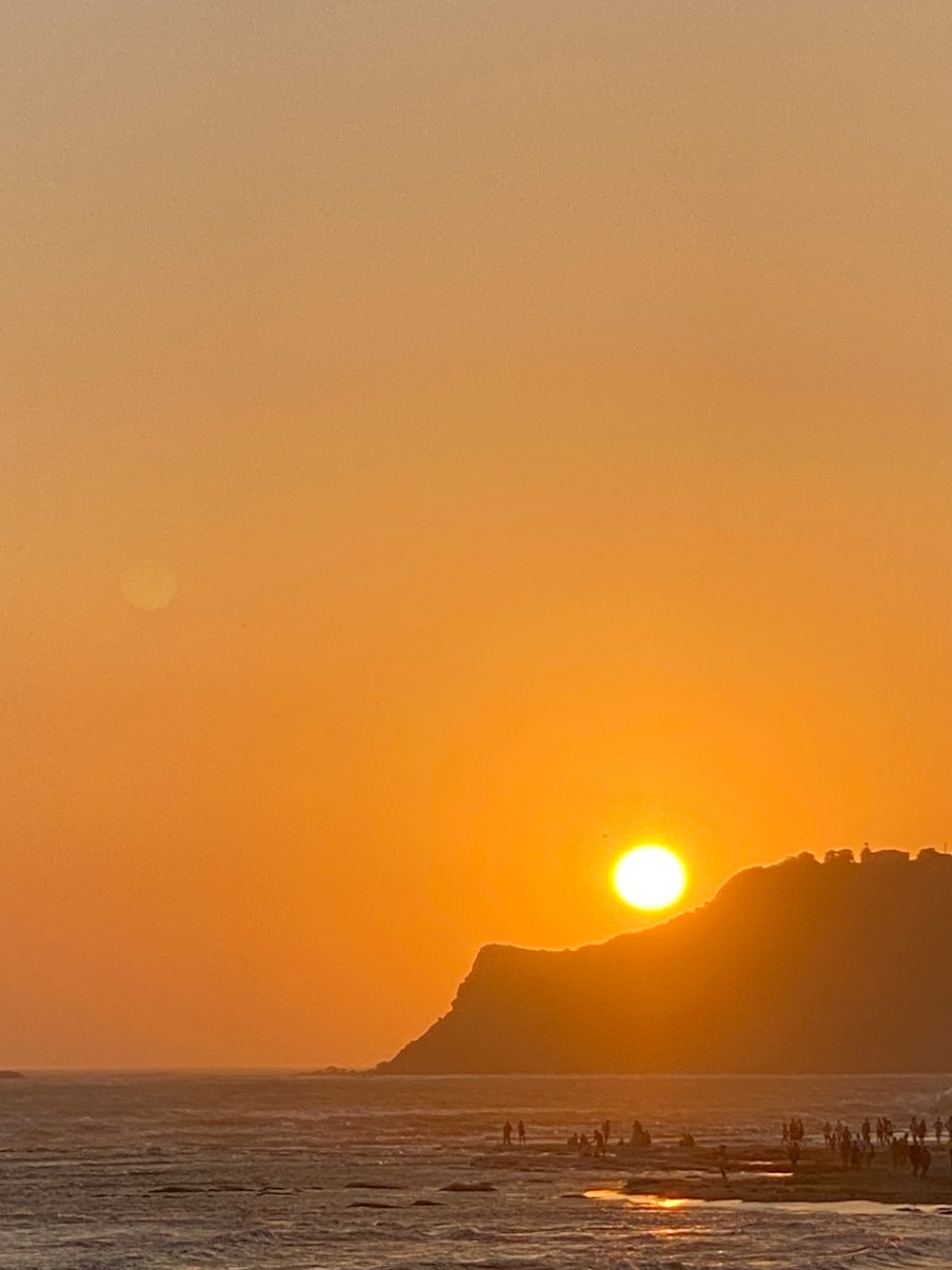
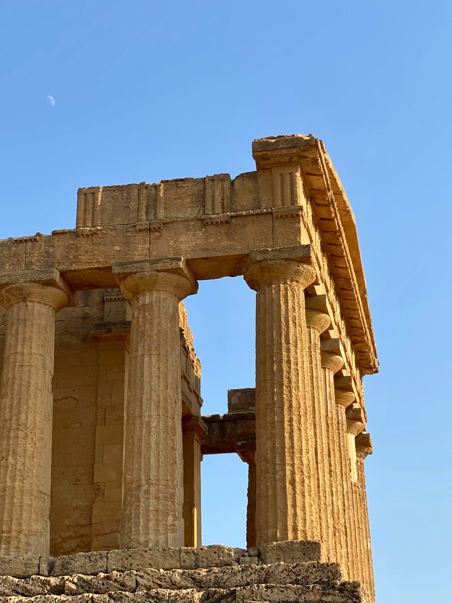
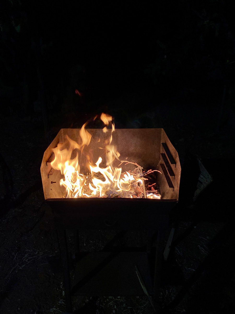
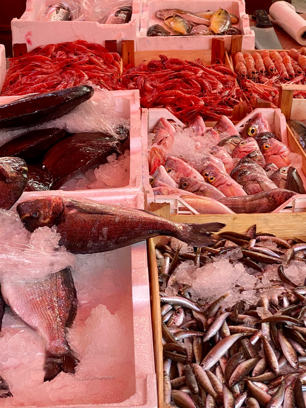
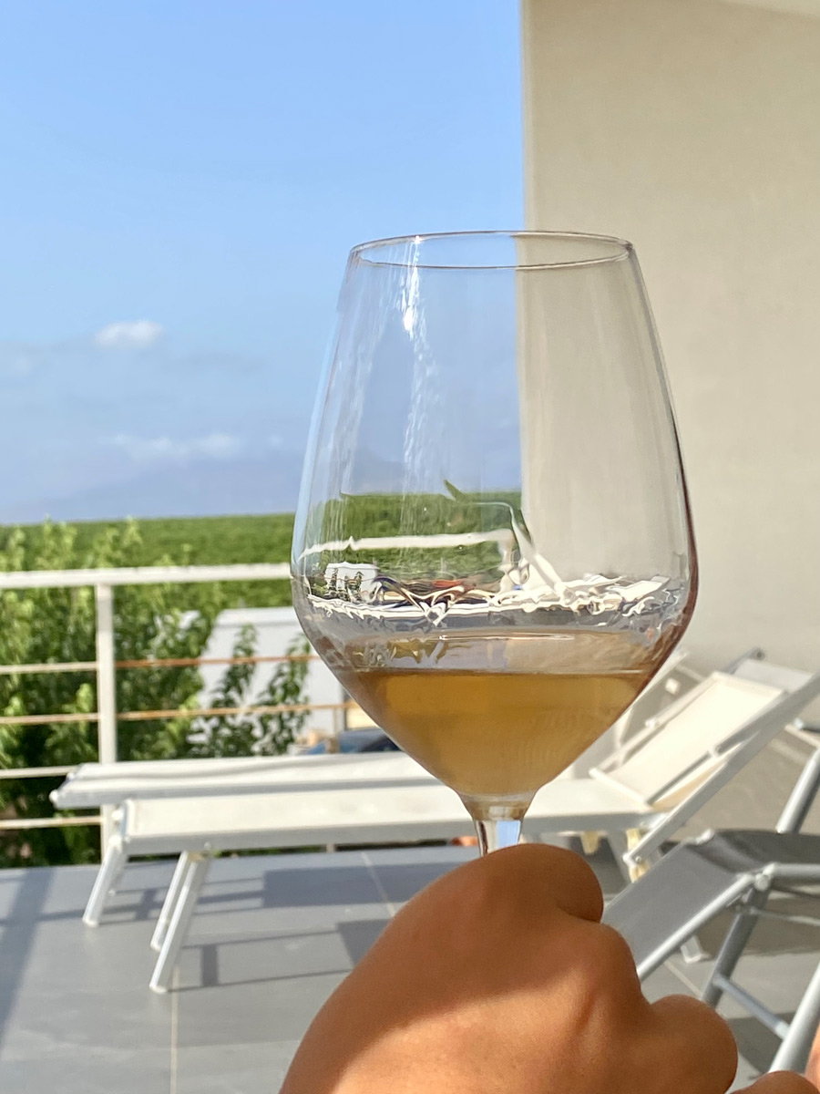
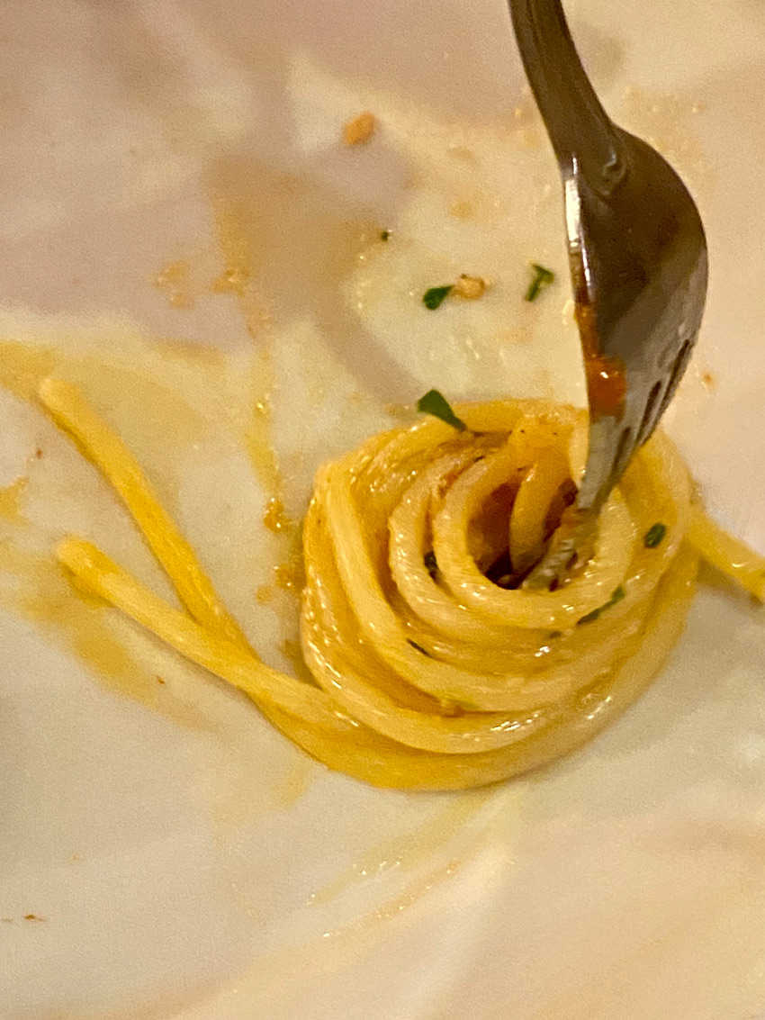
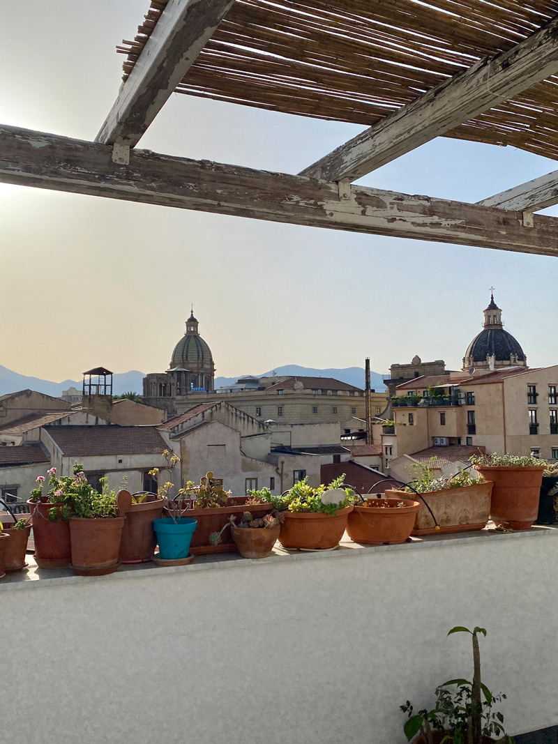
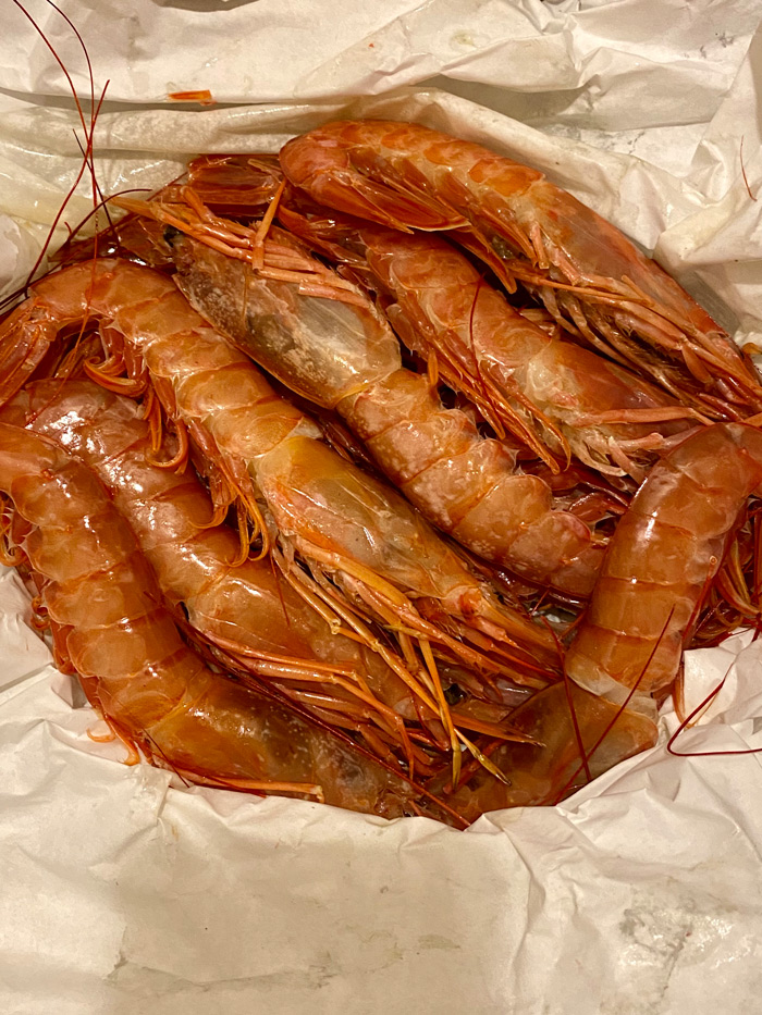
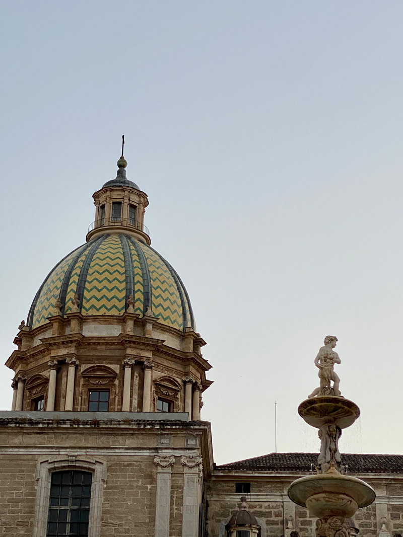
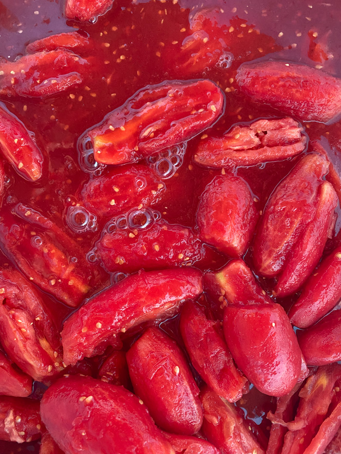
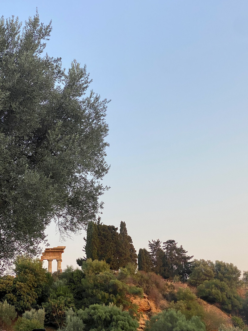
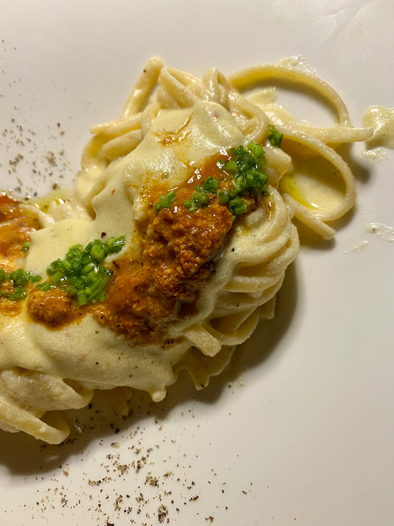
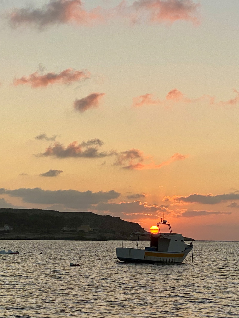
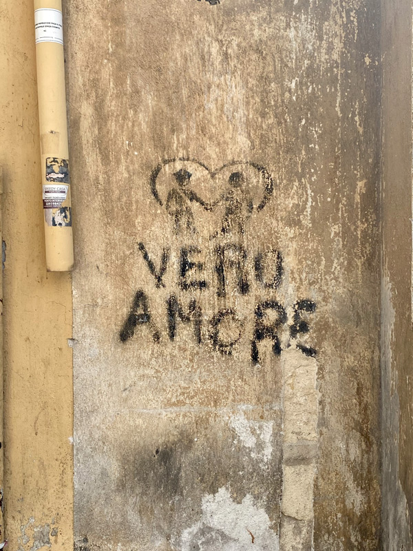
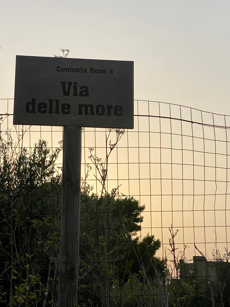
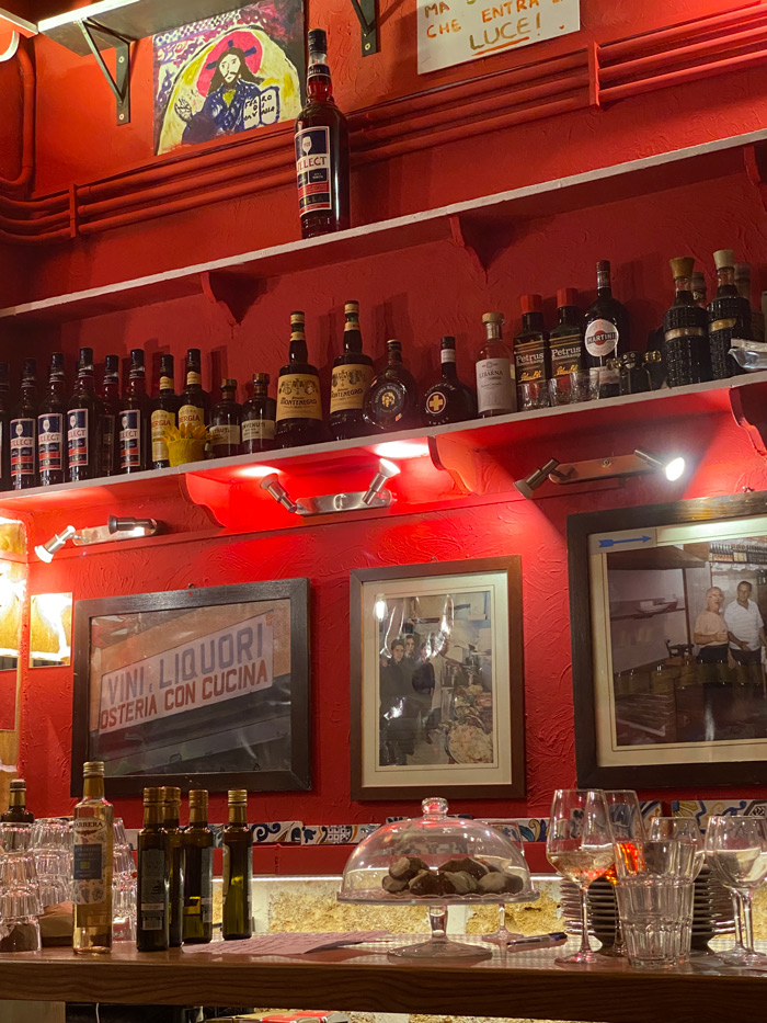
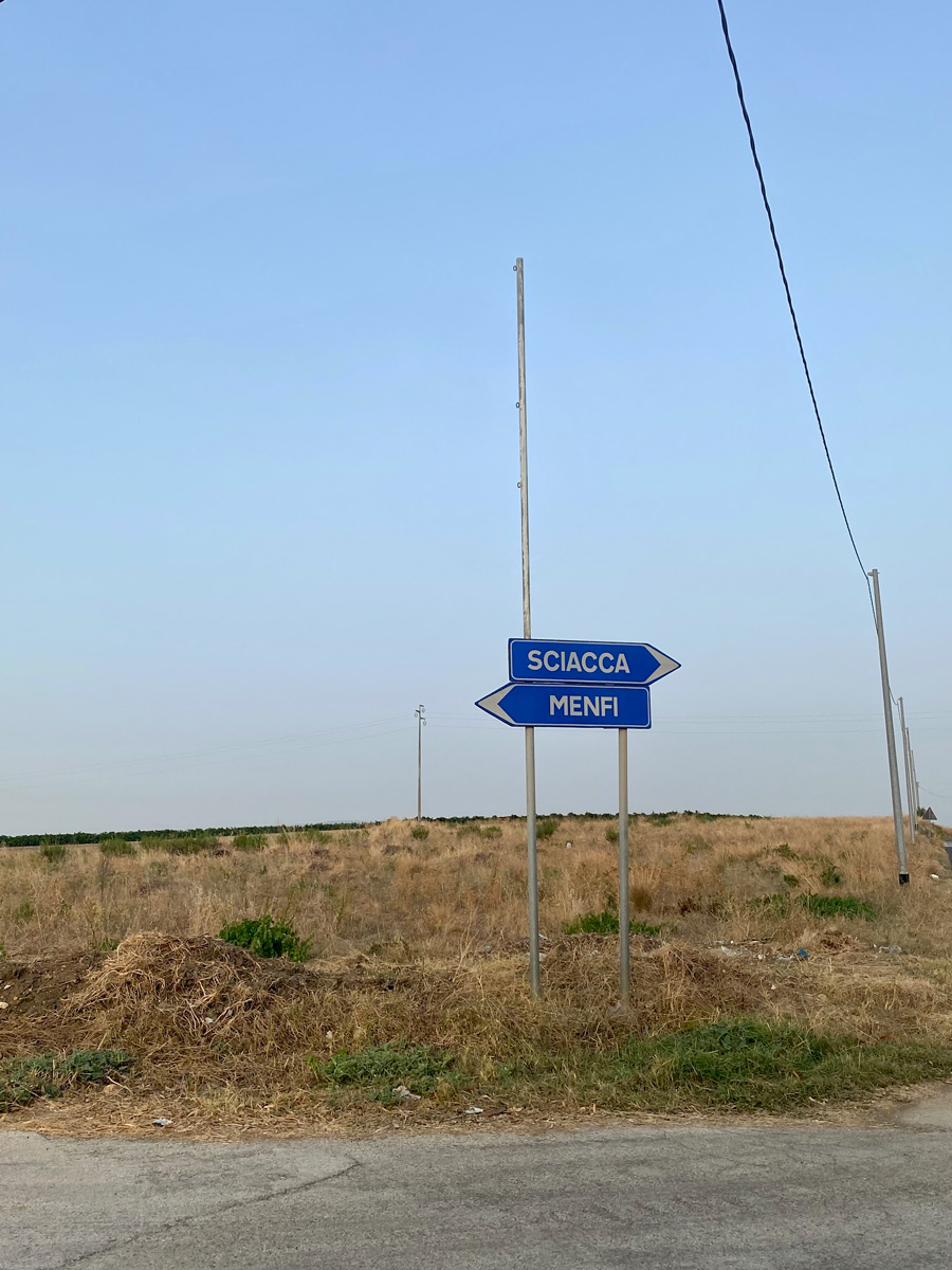
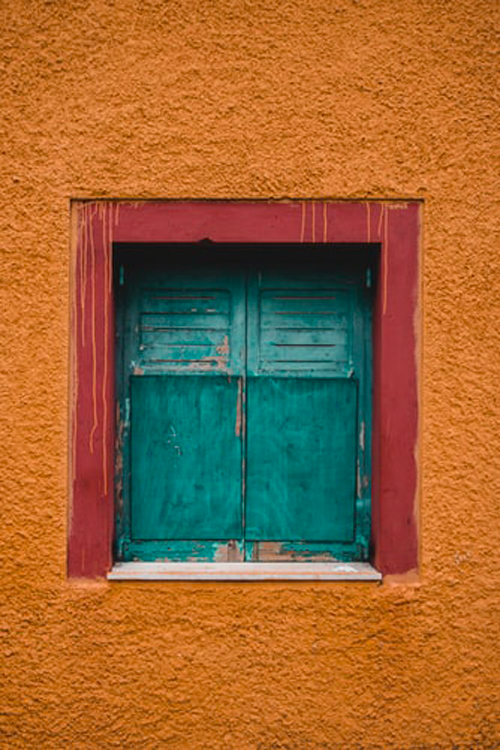
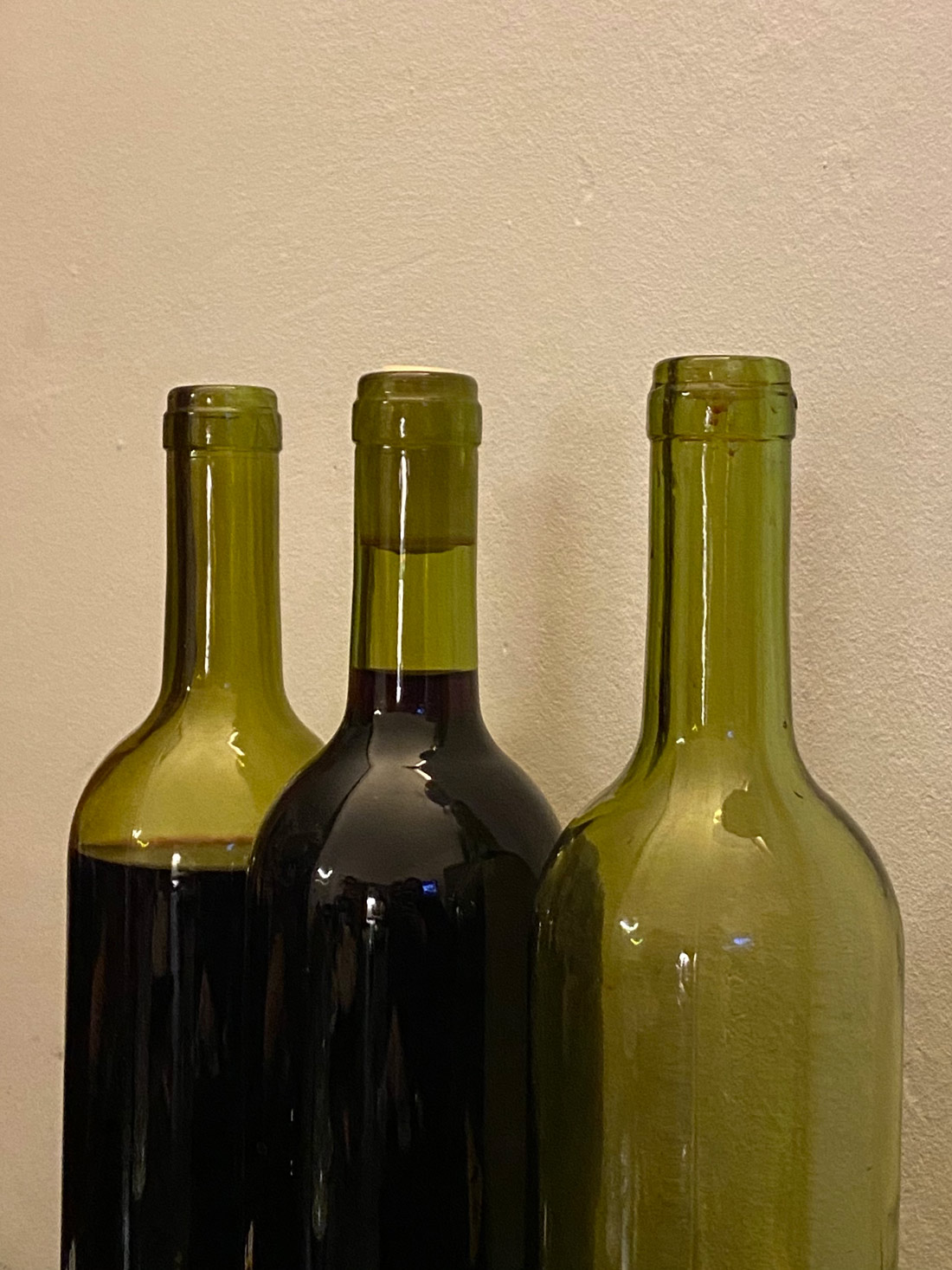
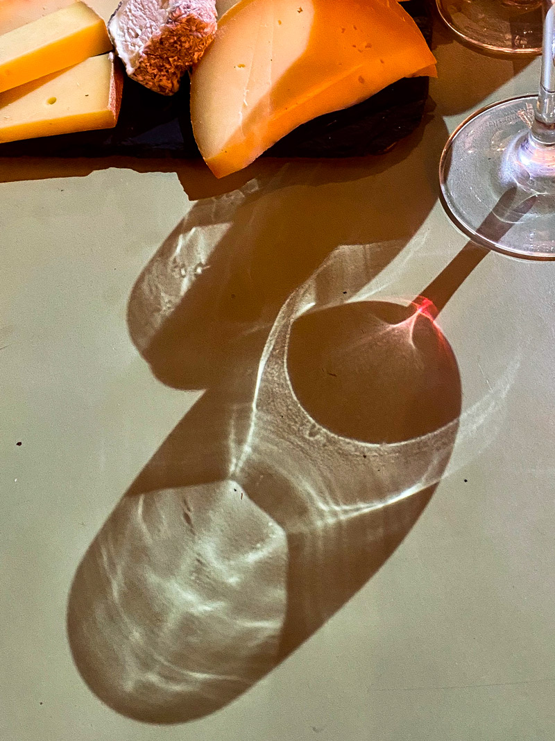
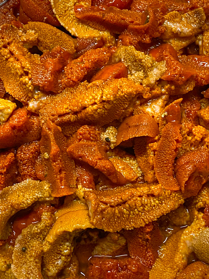
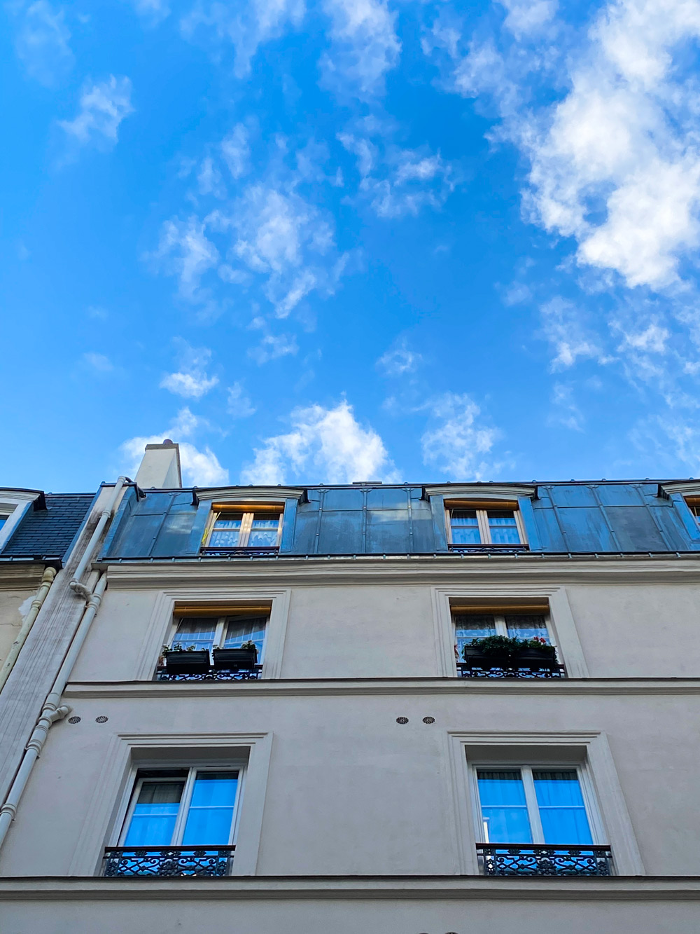
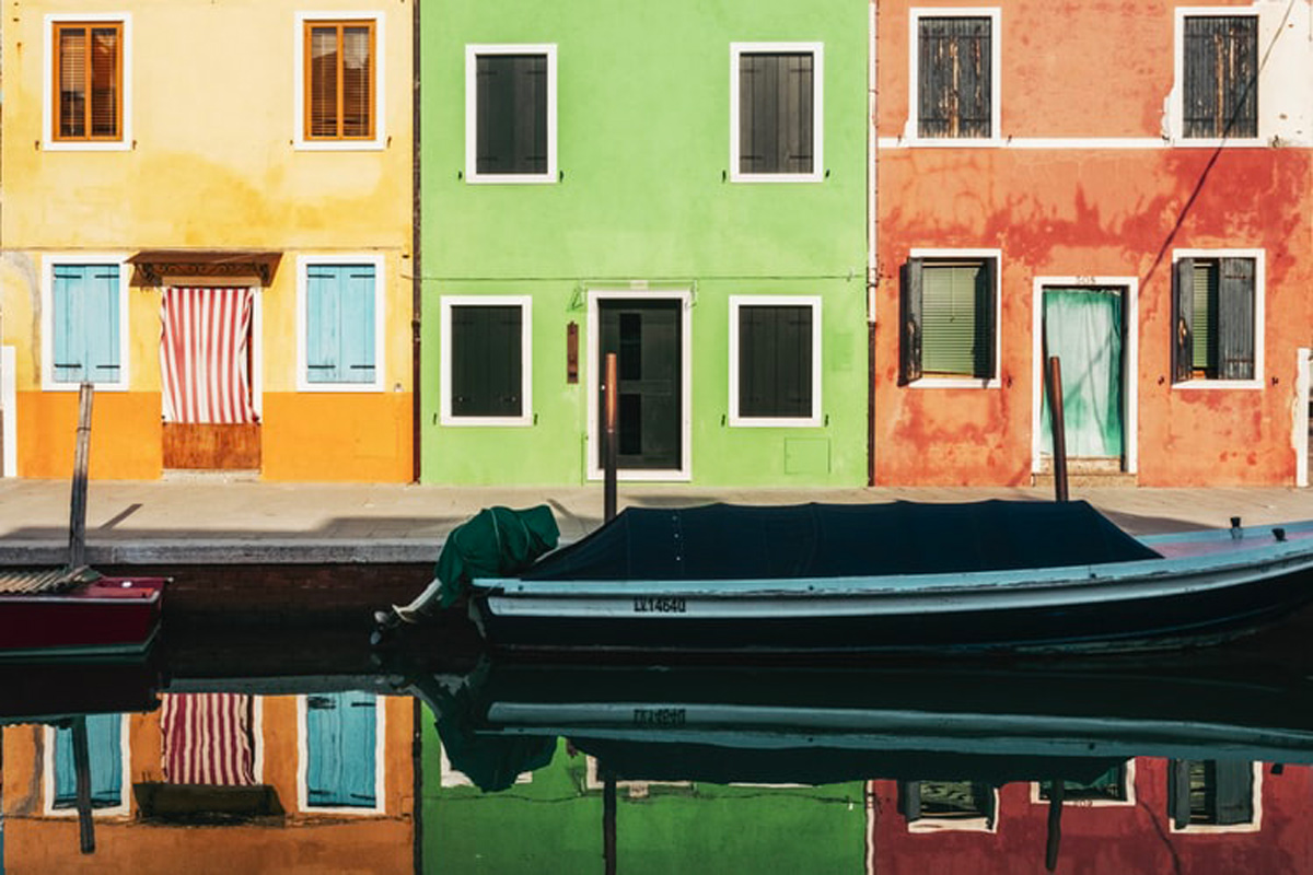
Inspo
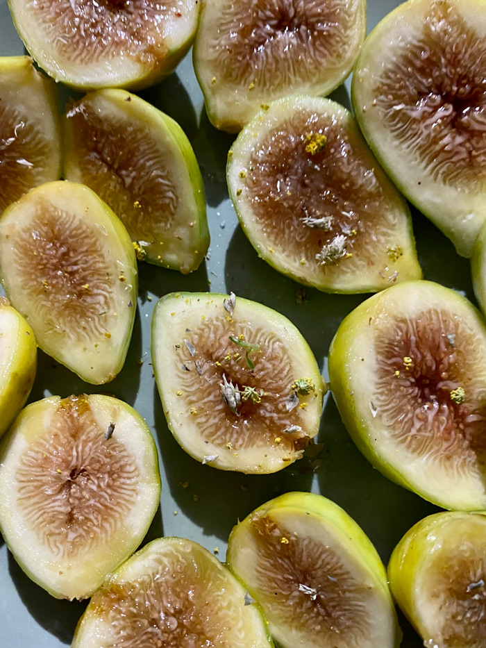
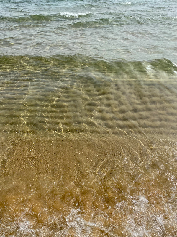
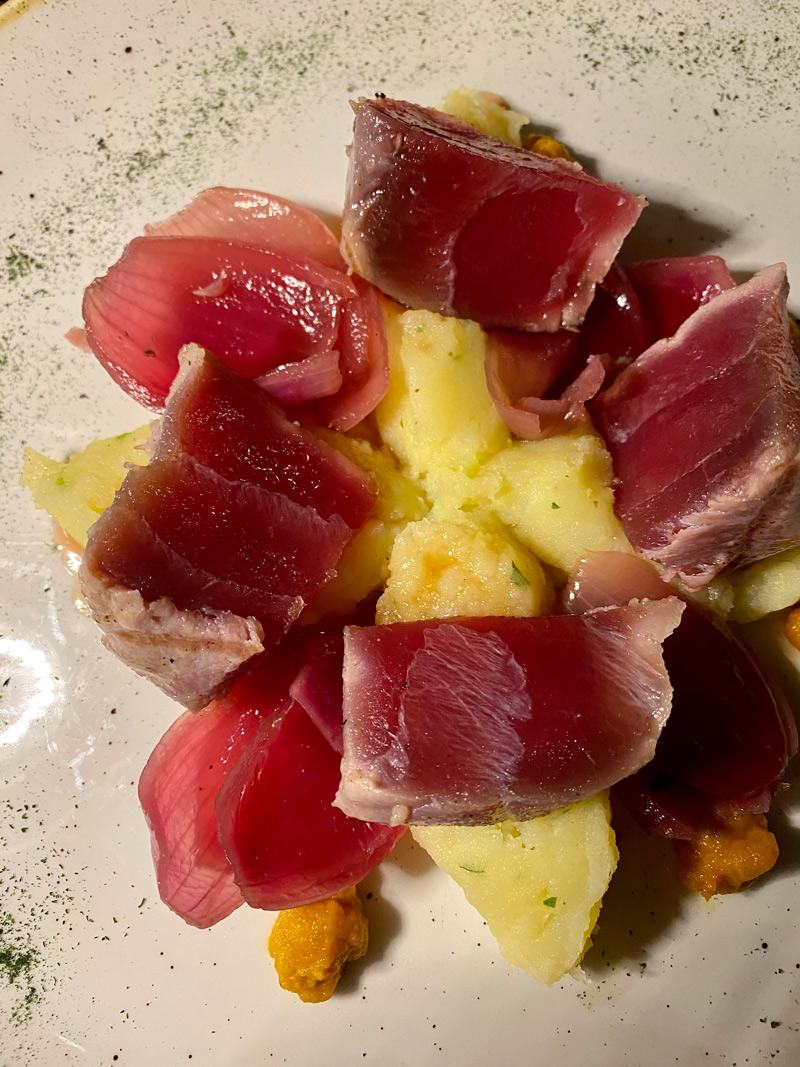
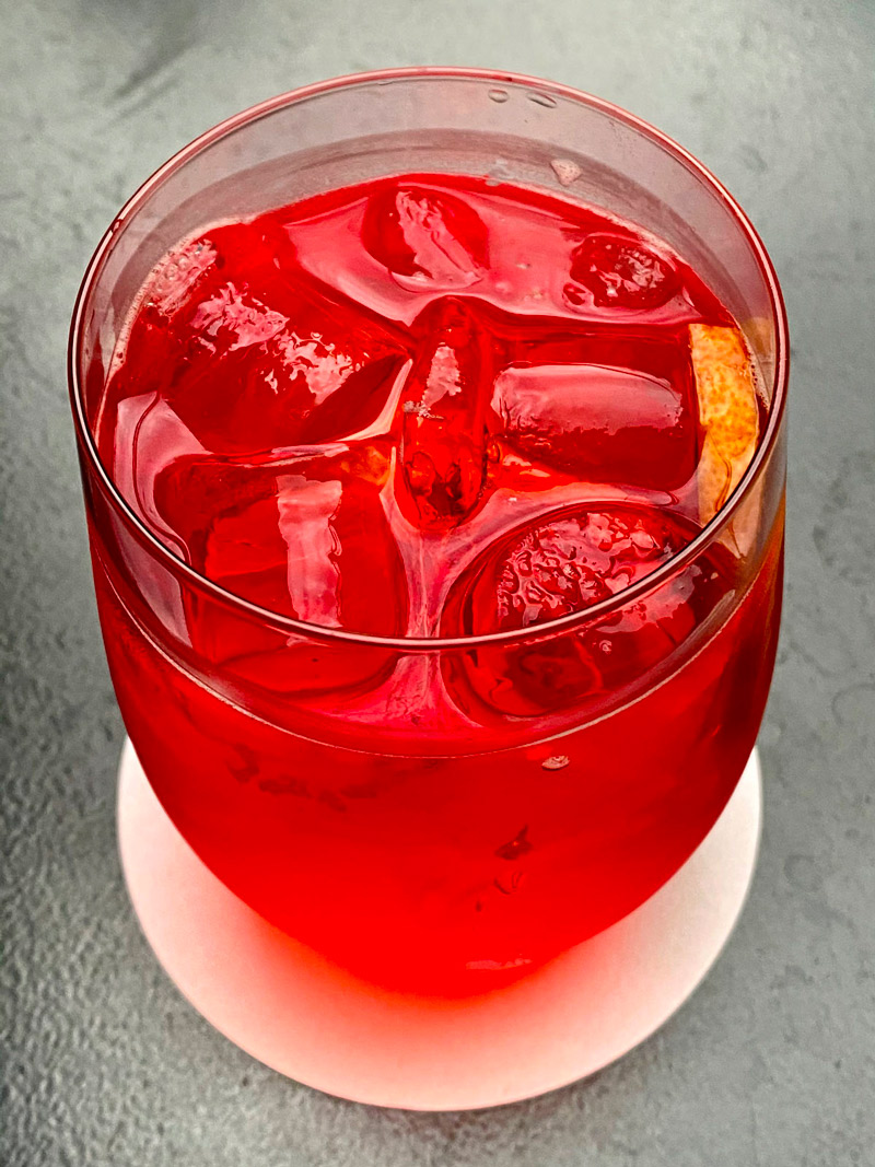
Cooking & photos
The "Inspo" part is the one that makes me explore the most the world around me; consequently I expand my curiosity and personality.
Here I combine two of my passions: food and photography.
My mantra for the first one is simple: "Feel what you cook, cook what you feel; make sure it’s love." I adore cooking for myself and for the others
trying to make my persona known.
At the same level of cuisine there is my second passion: photography. I take pictures of whatever I consider valuable, unique and stimulates my curiosity:
from food to daily life, every picture stimulates in me a singular emotion and an increase of what I consider a different point of view.
All the photographs are taken by me with an 11-pro Iphone, lately modified on Adobe Lightroom Classic.